PUBLIC REFERENCE
Minimalistpassword
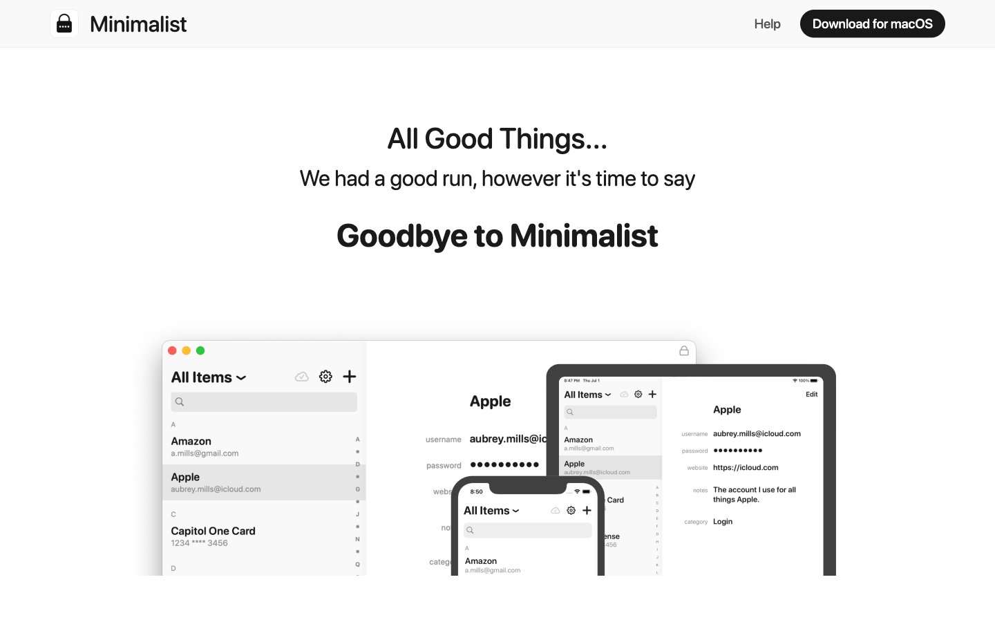
monochromatic information architecture on white
Colors
Canvas White
#ffffff Page backgrounds, card surfaces, primary interface canvas
Midnight Text
#1a1a1a Primary text, headings, strong content, default borders
Subtle Gray
#555555 Dark borders and separators for elevated surfaces and inverted UI. Do not promote it to the primary CTA color
Divider Gray
#eeeeee Hairline borders, subtle separators, background accents for subtle differentiation
OS Blue
#0d6efd Supporting palette color for small decorative accents when the core palette needs contrast. Do not promote it to the primary CTA color
Do
- Use 'Canvas White' (#ffffff) as the default background for all pages and most surfaces.
- Apply 'Midnight Text' (#1a1a1a) for primary headings and important textual content.
- Utilize 'Subtle Gray' (#555555) for body copy, secondary text, and less emphasized information.
- Employ 'Divider Gray' (#eeeeee) for subtle borders and horizontal rules.
- Form pill-shaped buttons and tags by applying a 1000px border-radius.
- Maintain high levels of achromatic contrast for readability, using 'Midnight Text' against 'Canvas White' or 'Divider Gray'.
- Structure page content using a max-width of 1320px, with content centered.
Don't
- Avoid using saturated brand colors for large background areas; maintain the achromatic dominance.
- Do not introduce complex shadows or depth effects; rely on spacing and minimal borders for visual separation.
- Refrain from tight spacing; use minimum 12px for element gaps and 60px for section gaps to ensure a spacious feel.
- Do not deviate from the 'Minimalist' typeface; it is central to the brand's identity.
- Avoid decorative imagery that competes with the UI's simple aesthetic; stick to product screenshots or clean icons.
- Do not use generic system link blue; prefer 'Subtle Gray' for inactive links and 'OS Blue' as a subtle accent only when necessary.