PUBLIC REFERENCE
Moving Parts
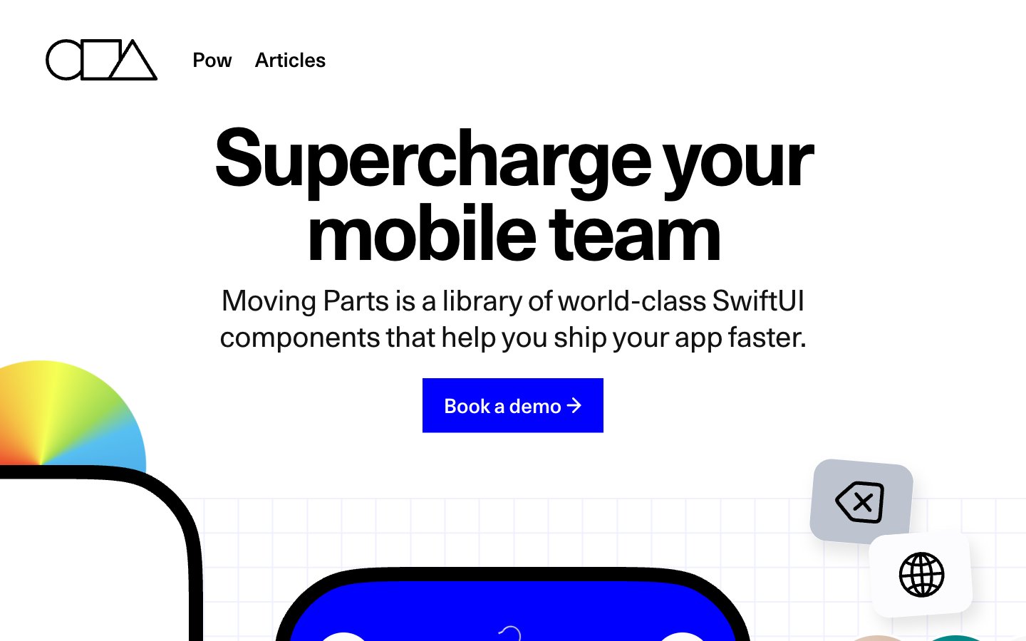
High-contrast geometric clarity
Colors
#000000 Primary text, headers, icon strokes, borders, and some background fills on dark sections. High contrast establishes a strong visual hierarchy
#ffffff Page backgrounds, card surfaces, secondary text on dark backgrounds, and icon fills. Provides a bright, expansive foundation
#121212 Secondary text in dark sections, subtle borders, and some elevated dark surfaces. Supports the dark mode appearance with a slightly softer black
#bcc1c7 Decorative background grids and subtle outlines. Creates texture without distracting from content
#efefef Subtle background panels and soft dividers. Adds a touch of warmth to the neutral palette
#b3b3b3 Less prominent text, borders, and subtle shadow effects. Indicates inactive states or secondary information
#999999 Muted helper text and tertiary information. Recedes into the background for less critical content
#0000ff Primary action buttons, interactive elements, highlights, and featured backgrounds. This vivid blue serves as the sole dominant brand accent
#00d37c Green wash for highlight backgrounds, decorative bands, and soft emphasis behind content
#57C0F1 Decorative gradients in abstract visuals or hero sections. Adds a burst of multi-chromatic energy
Do
- Use 'Midnight Ink' (#000000) for all primary text and headlines to maintain strong contrast.
- Apply 'Deep Royal Blue' (#0000ff) exclusively for primary calls to action and critical interactive elements.
- Utilize Unica77 for headlines and navigation, leveraging its font feature settings for characteristic glyphs and precise tracking.
- Favor large, confident typography for headlines, with tighter letter-spacing on larger sizes and normal spacing on body text.
- Maintain a clear visual hierarchy by limiting saturated colors to 'Deep Royal Blue' and 'Emerald Green' as deliberate accents.
- Employ the specific large border radii of 90.3833px for content cards and 106.333px for prominent containers to define component shapes.
- Ensure all interactive elements provide a comfortable 25px vertical and 30px horizontal padding, as seen on buttons and inputs.
Don't
- Do not introduce new saturated primary colors; adhere to 'Deep Royal Blue' as the sole dominant brand accent.
- Avoid generic small border radii; use the distinct 0px for buttons or the large values (90.3833px, 106.333px) for cards and containers.
- Do not use subtle gray backgrounds or text colors for primary content or calls to action; reserve them for secondary information or decorative grids.
- Do not add additional box-shadows beyond the single defined `rgba(0, 0, 0, 0.3) 15px 20px 30px 0px` for cards, maintaining a predominantly flat aesthetic.
- Do not break the rigid grid-like layout with free-form overlapping elements, maintaining structured geometric compositions.
- Avoid thin, lightweight typefaces for headlines outside of specific decorative uses; default to heavier weights for impact.
- Do not use 'Arial' or 'ui-monospace' for standard UI elements unless explicitly for code snippets, adhering to the brand's custom typefaces.