PUBLIC REFERENCE
Legora
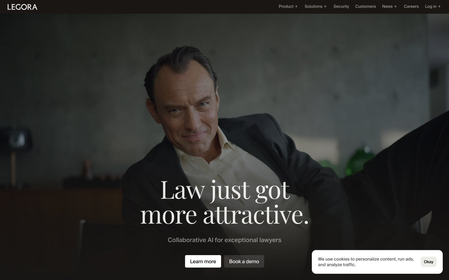
Warm monochrome legal canvas
Colors
Inkwell Black
#000000 Primary text, borders, dark background for hero section and certain UI elements
Canvas White
#fefefc Page background, primary light surface for cards and content sections
Text Gray
#0a0a0a Content text, secondary dark borders, slightly softer than Inkwell Black for body copy
Pale Ash
#ebf5ed Subtle background for UI elements, input fields, and alternating section backgrounds
Shadowstone Gray
#6b6b6b Muted helper text, secondary body copy
Whisper Gray
#444444 Tertiary text, even subtler than Shadowstone Gray, for very de-emphasized elements
Parchment Tan
#e1d5b6 Subtle background accent for specific sections, adding a warm, academic feel
Sky Tint
#bdd4f0 Background for certain interactive link states or prominent data blocks
Steel Blue
#98a7aa Background for specific link states, a cool accent
Do
- Prioritize high visual contrast between text (#000000, #0a0a0a) and background (#fefefc, #ebf5ed), maintaining AAA accessibility standards.
- Use Rhymes Display Light (weight 300) for large headlines (32px and up) with a tight line height and negative letter-spacing for a refined, spacious feel.
- Apply Suisse Intl Book (weight 450) consistently for all body text, maintaining its specific font feature settings for brand consistency.
- Utilize Pale Ash (#ebf5ed) as a subtle alternating background color for content sections, providing visual rhythm without strong division.
- Employ a radius of 8px for cards, images, and input fields to convey a soft, modern touch.
- Ensure interactive elements like buttons and links maintain a clear visual distinction, even if the primary action color is derived from a browser default.
- Use Inkwell Black (#000000) for hero section text and prominent borders to create a strong initial impression against dark backgrounds.
Don't
- Avoid using highly saturated colors for large UI elements; accents should be subtle and functional.
- Do not introduce strong drop shadows; rely on background color changes or minimal borders for surface differentiation.
- Do not deviate from the specified font families and weights, especially for Rhymes Display Light, as its unique weight defines the brand's headline style.
- Avoid over-clustering content; embrace white space and the specified elementGap (10px) to maintain a compact yet uncrowded appearance.
- Do not use generic system borders for inputs; always apply Pale Ash (#ebf5ed) background and 8px border-radius.
- Do not use multiple button styles for primary actions; stick to the translucent white filled button on dark backgrounds and the outlined white button on light backgrounds.
- Avoid full-bleed imagery that competes with text; imagery should be contained or used as a subtle background element as seen in the hero.