PUBLIC REFERENCE
Arcade
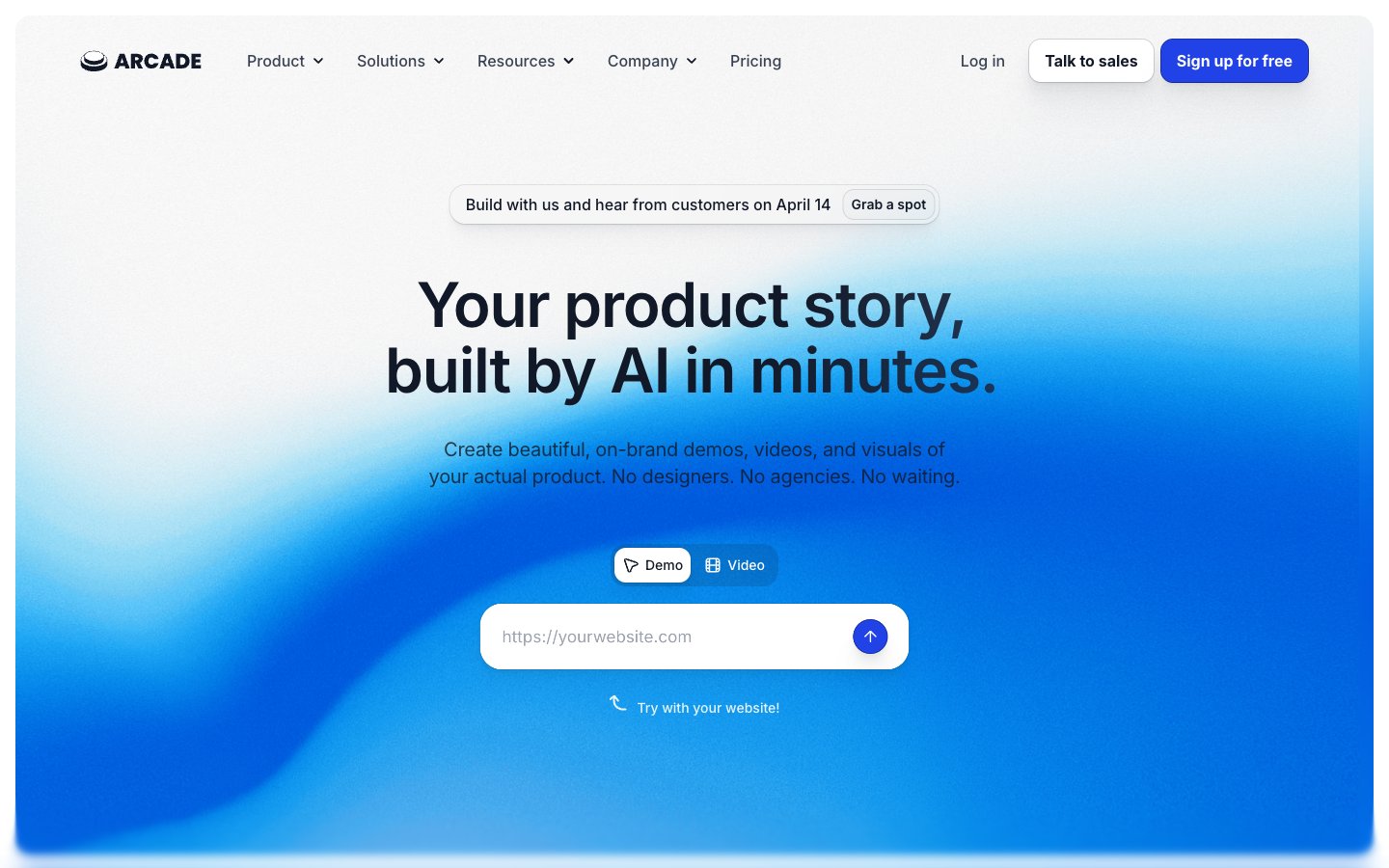
Crisp Blueprint on White Canvas. Clean surfaces frame sharp typography and a singular, vibrant blue, like a detailed architectural plan on a clear white sheet, accented by a distinct highlight.
Colors
#ffffff Page backgrounds, card surfaces, button backgrounds, primary text on dark elements.
#f9fafb Subtle background for UI elements and slight section differentiation.
#e5e7eb Primary border color for buttons and input fields, indicating interactive boundaries.
#111827 Primary text color for headings and body, offering high contrast against light backgrounds. Also used as background for dark sections and button text on light buttons.
#4b5563 Secondary text color for body copy, subheadings, and muted links. Provides visual hierarchy by being less dominant than Graphite Text.
#374151 Decorative text in navigation and links. A slightly lighter nuance than Slate Text.
#70747d Subtle secondary text, border colors, and subtle button states, providing softer visual cues.
#2142e7 Primary brand color for calls to action, active states, and focus indicators. Its vivid nature stands out against the muted neutral palette.
#182fa5 Darker shade of Arcade Blue used for button borders and subtle shadows, adding depth to interactive elements.
#111827 Base color for complex background gradients, often appearing in hero sections or prominent content blocks. Paired with gradient accents.
#2142e7 Vivd blue accent within gradients, creating dynamic energy within dark sections, used in banners and hero elements.
Do
- Prioritize Inter font for all text elements, leveraging weights 400-700. Reserve Balig Script for highly decorative brand elements if necessary, ensuring it never competes with Inter for readability.
- Use Arctic White (#ffffff) as the base background for most sections, broken by Whisper Gray (#f9fafb) for subtle differentiation, making content feel spacious and clear.
- Apply Arcade Blue (#2142e7) exclusively to primary calls to action and active states, ensuring high visibility and clear user pathways.
- Utilize border radii of 12px for buttons and navigation items, and 16px for input fields and general components, creating a soft but not overly rounded aesthetic.
- Implement consistent letter spacing: -0.0250em for 64px, -0.0200em for 48px, -0.0150em for 40px, -0.0100em for 36px and 30px, and -0.0070em for 28px and 24px, optimizing legibility for larger text.
- Apply subtle elevation provided by rgba(17, 24, 39, 0.04) box shadows to interactive elements and cards, giving a sense of depth and hierarchy without being heavy.
Don't
- Do not introduce new vibrant colors outside of the defined Arcade Blue (#2142e7) palette; maintain the controlled use of color to avoid visual clutter.
- Avoid using harsh, abrupt transitions or sharp angles. Leverage the established border radii (12px, 16px, 72px) to maintain the soft, approachable feel.
- Do not use dark backgrounds for general body text sections; preserve the light-themed composition for readability and a composed appearance.
- Refrain from excessive use of gradient backgrounds. Limit them to hero sections or distinct banners to maintain their impact.
- Do not deviate from the specified typography scale and letter spacing values. Inconsistent typography disrupts the visual rhythm and perceived quality.
- Avoid arbitrary padding values; stick to the defined spacing scale (4px, 8px, 10px, 12px, 16px, 24px, 32px, 40px, 48px), especially for component internal spacing.