PUBLIC REFERENCE
Clerk
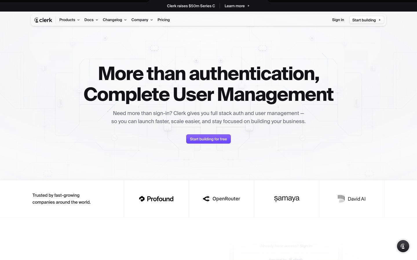
Developer's Prism. A system that refracts a single beam of brand identity into two distinct light and dark spectrums for different audiences.
Colors
#6c47ff Primary CTAs, active states, key highlights — a single sharp point of interaction against neutral backgrounds.
#6248f6 Abstract background gradient for the hero section, creating a soft, ethereal atmosphere.
#5de3ff Accent color for code syntax highlighting and occasional illustrative details.
#fff963 Accent color used within gradients and for code syntax highlighting.
#ef4444 Error messages and destructive action indicators.
#ffffff Light theme backgrounds, text on dark backgrounds and buttons.
#f7f7f8 Off-white background for subtle section differentiation on the light theme.
#eeeef0 Light borders and subtle UI rule lines.
#d9d9de Default border color for inputs and UI dividers in the light theme.
#9394a1 Secondary text, placeholders, and icon fills on light backgrounds.
#747686 Tertiary text and subtle metadata.
#5e5f6 Text color on dark cards, designed for a lower-contrast, glowing feel.
#42434d Secondary dark button backgrounds.
#212126 Card and component surfaces in the dark theme.
#131316 Primary text on light backgrounds, and the base background color for the dark theme.
#000000 Display headlines and high-contrast primary text.
Do
- Use the dual theme structure: light for top-level marketing, dark for in-depth feature sections.
- Apply negative letter-spacing to all `geistNumbers` headlines larger than 24px.
- Reserve `Clerk Violet (#6c47ff)` exclusively for primary CTAs and interactive focus states.
- On dark surfaces, use inset `box-shadow` with a subtle white color to create the signature 'pressed-in' highlight.
- Use a `6px` radius for interactive elements like buttons and inputs, and a larger `12px` for container cards.
- Maintain generous `96-128px` vertical spacing between page sections.
- For dark theme cards, use `Onyx (#212126)` for the background and `Iron (#5e5f6e)` for text to achieve a lower-contrast, glowing effect.
Don't
- Don't use drop shadows in the dark theme; use inset highlights instead.
- Don't apply `Clerk Violet` to large fields of color or body text.
- Don't mix radii; stick to the `6px/12px/9999px` system.
- Don't build pages using only one theme; the light/dark transition is a core part of the identity.
- Don't use pure black (#000000) for dark theme backgrounds; use `Deep Space (#131316)` for the page background and `Onyx (#212126)` for cards.
- Don't use photography; rely on UI mockups and abstract gradients.
- Don't round the corners of top-level navigation, header, or footer containers.