PUBLIC REFERENCE
basement.studio
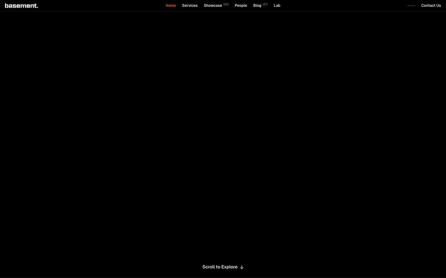
Void print shop at 3am — massive compressed type bleeding off a pitch-black canvas, one ember of orange light on the nav, everything else white or ghost-gray.
Colors
#ff4d00 Active nav state only — appears on a single interactive element as a hot indicator, never used for buttons or CTAs; its rarity is the feature
#000000 Page background, button fill, SVG fills — absolute black, not near-black
#ffffff Primary text, nav labels, button text, body copy
#e5e7eb Border color across nav, cards, buttons, logo grid dividers — the structural skeleton visible against black
#c4c4c4 Secondary text, subheadings, de-emphasized body copy, SVG fills
#757575 Tertiary text, muted labels, icon fills
#454545 Card/tile border color — used on logo grid cells to define structure without brightness
#2e2e2 Subtle element backgrounds, hover states, SVG fills
#1a1a1a Input backgrounds, input borders — the only surface that differs from absolute black
#666666 SVG illustration fills, decorative icon tones
Do
- Use #000000 as the only page background — never substitute near-blacks like #0a0a0a or #111111; the absolute void is intentional.
- Apply 0px border-radius to every element — buttons, cards, inputs, badges, all components. Any rounded corner breaks the system.
- Reserve #ff4d00 exclusively for the active nav state. Never use it on buttons, CTAs, icons, or decorative elements.
- Set display type (38px+) with font-feature-settings: 'ss01' and letter-spacing at minimum -0.02em, scaling to -0.04em at 76-87px.
- Use 1px solid #454545 borders on grid tiles and 1px solid #e5e7eb on interactive elements (buttons, nav items) — these two border shades create a two-tier hierarchy.
- Maintain Geist as the single typeface across all sizes from 12px caption to 87px display — no secondary or decorative fonts.
- Use #c4c4c4 for body copy under headlines rather than full white, creating luminosity hierarchy through brightness rather than size alone.
Don't
- Never add box-shadows, drop-shadows, or glows — the design has zero elevation; depth is created by type scale and color, not shadow.
- Never use rounded corners — not 2px, not 4px. The 0px radius is non-negotiable across every component.
- Never introduce a secondary typeface — not for decorative headlines, not for code blocks, not for quotes.
- Never place #ff4d00 on backgrounds, fills, or decorative shapes — it exists only as a 1-element text color signal.
- Never use white (#ffffff) for body-level descriptive text — use #c4c4c4 or #757575 to preserve the display headline as the luminance peak.
- Never add gradients to backgrounds or text — the system is flat, matte, and binary in its color application.
- Never apply padding greater than 16px to inline or small components — the spacing system is compact (4px base unit) and dense grid arrangements should not breathe excessively.