PUBLIC REFERENCE
Anthropic
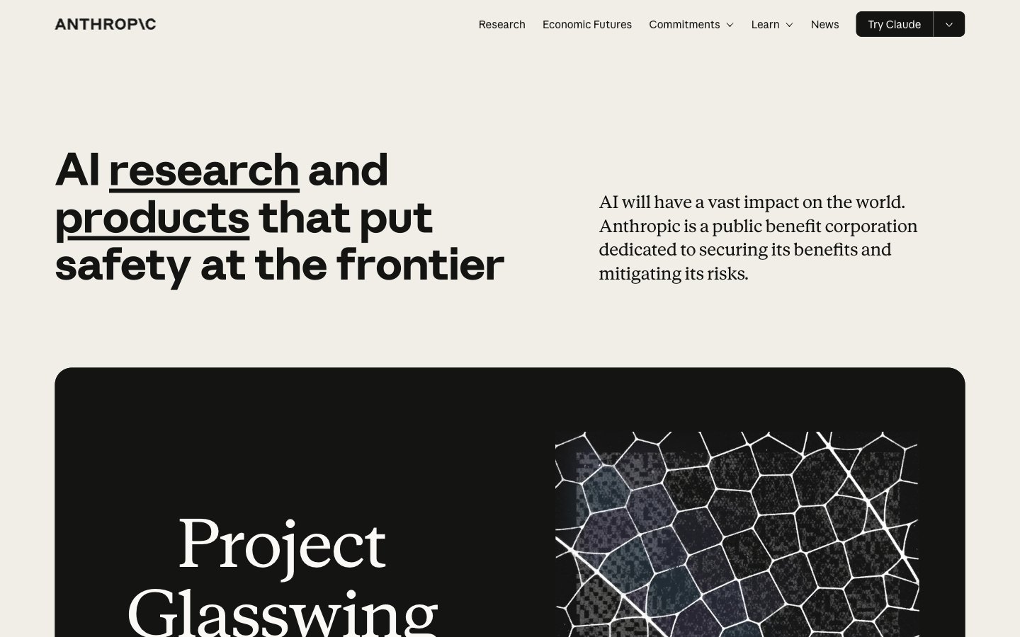
Research journal printed on warm stone — authoritative typographic composition where word-level underlines replace color as the primary emphasis mechanism, and the only warmth comes from the paper itself.
Colors
#141413 Primary text, borders, nav items, icon fills, card backgrounds — the near-black that appears on both light and dark surfaces, making it function as both foreground and background
#faf9f5 Page background, button fills, light surface base — the warm off-white that gives the site its parchment character instead of clinical white
#f0eee6 Nav backgrounds, secondary surface level, border highlights
#e8e6dc Body text on dark backgrounds, dividers, subtle borders
#e3dacc Tertiary surface backgrounds, warm mid-tone fills
#b0aea5 Disabled/muted borders, secondary interactive borders, subdued UI chrome
#d1cfc5 Dividers, hairline borders, inactive states
#87867f Secondary text, meta labels, timestamps
#3d3d3a Mid-dark borders, focus rings on light surfaces
#5e5d59 Tertiary text, captions, footer secondary content
#d97757 Accent CTA elements, highlight states — warm terracotta held in reserve for moments of intentional warmth against the achromatic base
#c6613f Deeper accent state, hover/pressed clay interactions
#788c5d Thematic tag or category label color variant
#6a9bcc Thematic tag or category label color variant
#c46686 Thematic tag or category label color variant
#bcd1ca Thematic tag or category label color variant
Do
- Use #faf9f5 (Ivory Light) as the page base — never pure white (#ffffff) or neutral gray.
- Apply borderRadius 0px to all buttons and interactive controls except the primary 'Try Claude' CTA which uses 0px 0px 8px 8px (asymmetric: flat top, rounded bottom only).
- Emphasize headline keywords with a thick text-decoration underline only — never color, bold weight increase, or highlight backgrounds — as the sole decorative emphasis mechanism.
- Use Anthropic Serif at display sizes (91px, weight 400) exclusively within dark (#141413) surface cards; use Anthropic Sans for all light-surface headlines.
- Restrict chromatic color to the CSS accent palette (Clay #d97757, Olive #788c5d, etc.) and deploy it sparingly — one accent per section maximum; default state uses zero chromatic color.
- Set dark editorial feature cards to borderRadius 24px and keep them full content-column width with hard clipping of interior imagery at the same radius.
- Use Anthropic Mono 16px for metadata field labels (DATE, CATEGORY) in card footers — the mono/grotesque contrast signals structured data within editorial layout.
Don't
- Never use pure white (#ffffff) or pure black (#000000) as a surface background — all surfaces must come from the ivory/slate token range.
- Never add box-shadows or drop-shadows to any component — surface contrast and border lines are the only depth signals.
- Never round button corners uniformly — the 0px radius is a deliberate formal signal; avoid introducing 4px, 6px, or pill buttons.
- Never use Anthropic Serif on the page's ivory background at large sizes — the serif display scale is reserved for the dark card inversion.
- Never apply multiple chromatic accent colors within a single section — the palette tokens (Clay, Sky, Fig, Olive) are categorical variants, not combinable accents.
- Never use background fills for badge or label components — metadata labels are pure text with no chip, pill, or capsule treatment.
- Never replace the underline emphasis mechanic with color emphasis on headlines — links within headlines underline, they do not change color.