PUBLIC REFERENCE
FLORA
Midnight command center
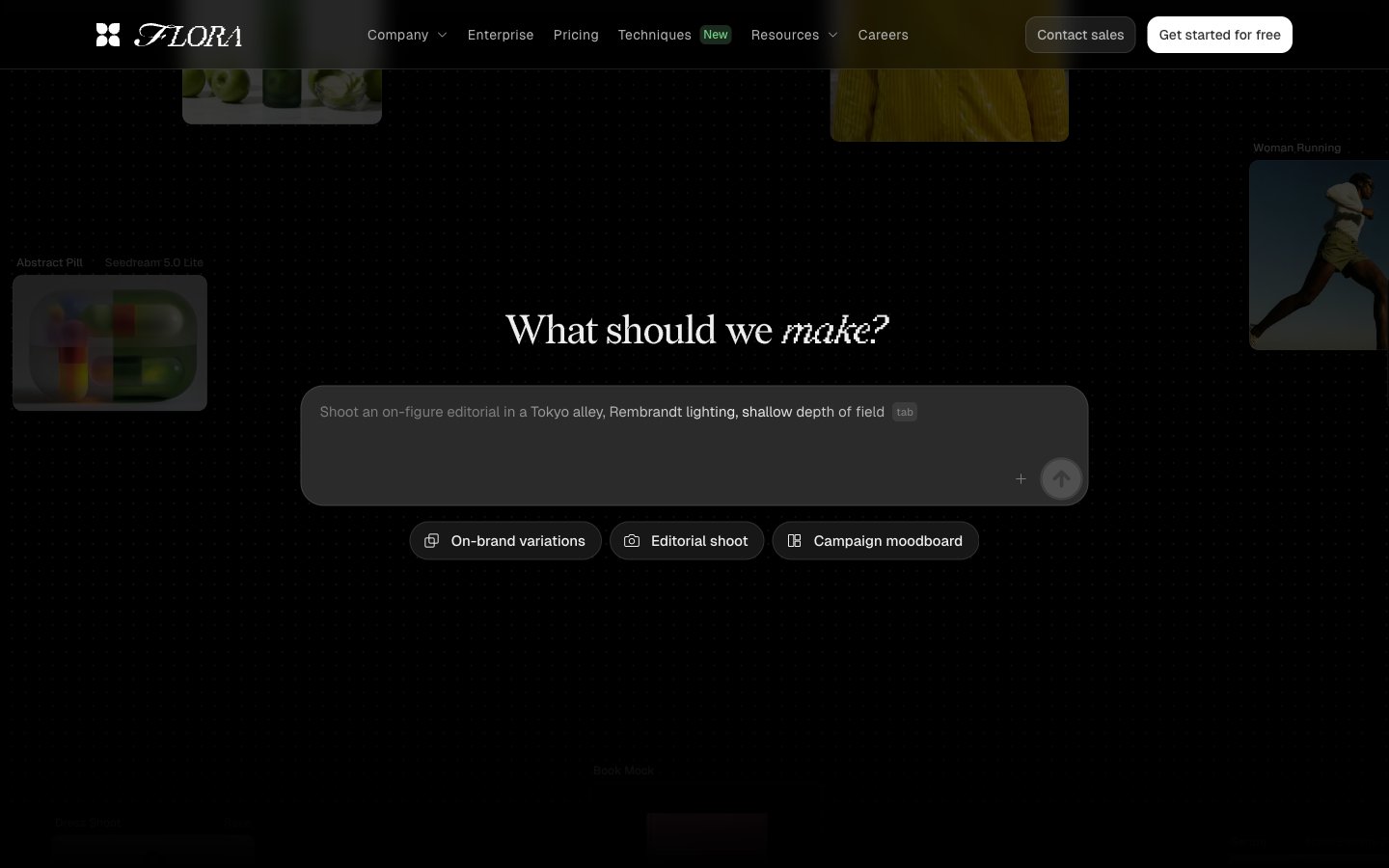
Colors
#000000 Page backgrounds, primary text for inverted states, primary borders, image borders — defines the core dark canvas
#191919 Card surfaces, elevated backgrounds, and subtly darker button backgrounds — creates surface hierarchy on the dark canvas
#eeeeee Primary text, headings, input text, ghost button borders, and iconography — high contrast against dark backgrounds
#606060 Muted headings, secondary text, and fill for less prominent icons — provides a lower contrast textual element
#b4b4b4 Muted helper text, secondary borders, and subtle background elements — for granular text and subtle visual separation
#7b7b7b Tertiary text, link text, ghost button borders, and decorative elements — lower prominence text and structural lines
#303030 Subtle card backgrounds and decorative strokes — adds a slight depth without strong contrast
#bfbfbf Helper text and decorative borders — for very light cues against dark backgrounds
#050505 Subtle button borders and icon outlines — for minimal distinction on dark surfaces
#71d083 Green outline accent for tags, dividers, and focused UI edges.
Do
- Prioritize Absolute Zero (#000000) for page backgrounds and Deep Charcoal (#191919) for card surfaces to maintain the dominant dark theme.
- Use Off White (#eeeeee) for all primary text, headings, and essential UI elements for readability and high contrast.
- Apply Geist as the primary typeface for body text and interactive elements, leveraging its custom features for precise control like 'blwf', 'cv03', 'cv04', 'cv09', 'cv11'.
- Maintain a compact horizontal padding of 14px for buttons and 10px or 12px for interactive elements to create a dense, functional feel.
- Utilize a 9999px border-radius for all primary buttons and tags to create a distinct pill shape.
- Reserve Vivid Green (#71d083) exclusively for 'New' tags and subtle, functional accents, avoiding overuse to preserve its impact.
- Employ a base unit of 4px for all spacing decisions, creating a compact and consistent element distribution.
Don't
- Avoid using bright or overly saturated colors for large surface areas; color should primarily serve as functional highlight or subtle accent.
- Do not introduce heavy box shadows or strong elevation effects; maintain the predominantly flat, dark aesthetic.
- Do not vary line-heights significantly for body text; keep type compact and precise.
- Never use generic sans-serif fonts where Geist is specified; the unique letter-spacing and features of Geist are integral to the brand identity.
- Avoid wide padding on cards or sections, as the design prioritizes a compact, information-dense layout.
- Do not use dark text colors on mid-tone gray backgrounds, as contrast will be insufficient for this dark theme.
- Do not use bold weights indiscriminately; the system mostly relies on lighter or regular weights, with specific heavier weights for structured data or distinct headings.