Apple
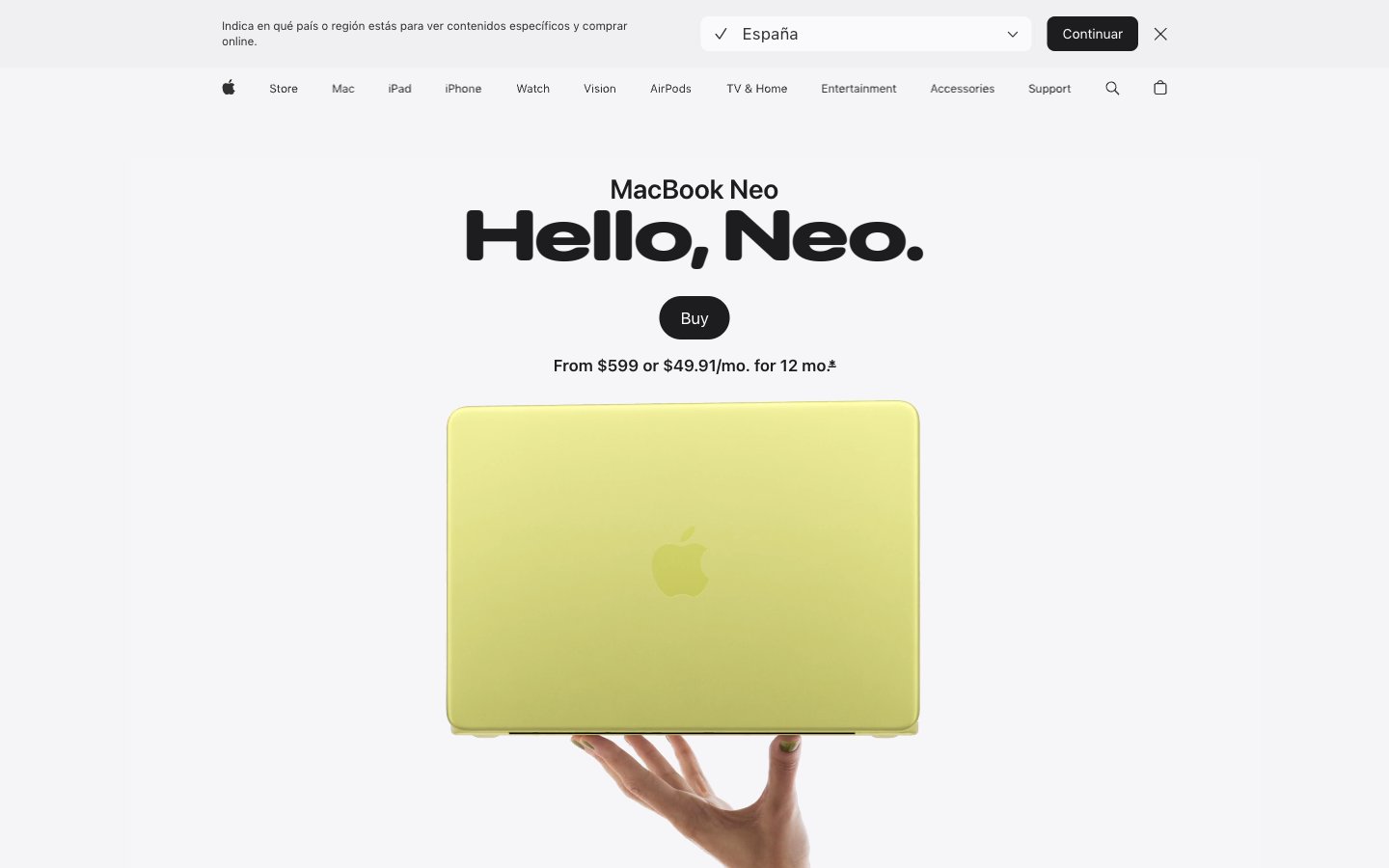
Gallery wall at natural light — enormous type casts shadows on a white surface, color enters only as product.
Palette
#1d1d1fPrimary text, headings, nav labels, icon fills — near-black with just enough warmth to avoid harshness on white
#707070Secondary body copy, captions, footnotes, muted nav items
#474747Tertiary body text, supporting link text, secondary nav
#333333Icon strokes, mid-weight body text, button labels in ghost state
#f5f5f7Page canvas background, section divider bands, badge fills
#ffffffCard surfaces, nav background, elevated container fills
#000000Dark card variant, hero icon fills, maximum-contrast black card
#e8e8edFrosted pill button background (country selector), input backgrounds
#0071e3Primary CTA button fill, active nav 'Buy' button — the sole permission-to-act color on the entire page
#0066ccInline text links, navigation anchor colors — slightly darker than Azure to distinguish interactive text from interactive buttons
#dddc8cMacBook Neo Citrus finish showcase backdrop — dark-to-citrus theatrical product gradient
#2535e2MacBook Neo Indigo finish showcase backdrop — dark-to-deep-blue theatrical product gradient
Type & geometry
role: All marketing headlines, product name lockups, section titles. Weight 700 at 80-96px is the page's defining visual move — these headlines are 2-4 words at near-poster scale, taking up half the viewport before any product image appears. Negative tracking at display sizes (-0.022em at largest) tightens letterforms into a single typographic mass. · sizes: 21px, 24px, 28px, 32px, 40px, 56px, 80px, 96px · family: SF Pro Display · weight: 600, 700 · lineHeight: 1.04–1.20 · substitute: Inter, system-ui · letterSpacing: -0.022em at 96px, -0.019em at 80px, -0.016em at 56px, -0.015em at 40px, -0.005em at 28px, +0.004em at 21px · fontFeatureSettings: "numr"role: Body copy, nav labels, captions, button labels, footnotes. Weight 400 at 17px is the default body size. Weight 300 appears at larger marketing sizes (20-24px) for subheadings that should feel lighter than headlines. Weight 600 for emphasis labels. The -0.003em tracking at body sizes is subtle but keeps dense paragraphs from sprawling. · sizes: 12px, 14px, 17px, 18px, 20px, 24px, 44px · family: SF Pro Text · weight: 300, 400, 500, 600 · lineHeight: 1.24–1.50 · substitute: Inter, system-ui · letterSpacing: -0.022em at 44px, -0.010em at 20px, -0.006em at 17px, -0.003em at 14px, -0.003em at 12px · fontFeatureSettings: "numr"Use with judgment.
- Use 28px border-radius for all feature cards (#ffffff and #f5f5f7 backgrounds) — this exact value is the page's geometric signature.
- Reserve #0071e3 exclusively for the primary 'Buy' CTA button. No other UI element uses this blue — its scarcity makes it the only color that reads as an imperative.
- Apply negative letter-spacing scaled to font size: -2.11px at 96px display, -0.9px at 56px heading-lg, -0.1px at 17px body. Positive or zero tracking at display sizes breaks the chiseled headline aesthetic.
- Use #f5f5f7 as page canvas and #ffffff as card surface. Never reverse this — cards must always be lighter than their parent background.
- Set SF Pro Display weight 700 for all primary product headlines at 56px and above. Weight 600 is for supporting headers (24-40px), never for hero text.
- Do not add box-shadow to any card or container. The entire elevation system is color-value-only — shadows break the flat-lit gallery effect.
- Do not use #0066cc (Cobalt Link) for button backgrounds. It is an inline text link color only — using it on filled buttons conflicts with the #0071e3 CTA hierarchy.
- Do not use font weight 300 for headlines below 40px — below that threshold, weight 300 loses definition against the white/fog background.
- Do not place two rounded-pill buttons side by side in the same visual zone. The 999px radius is rationed to one CTA per section to prevent diffusion of focus.
- Do not use the product finish colors (#dddc8c Citrus, #e8d0d0 Blush, #596680 Indigo) as semantic or UI accent colors — they exist only as product identity swatches and gradient source colors.