PUBLIC REFERENCE
GitHub
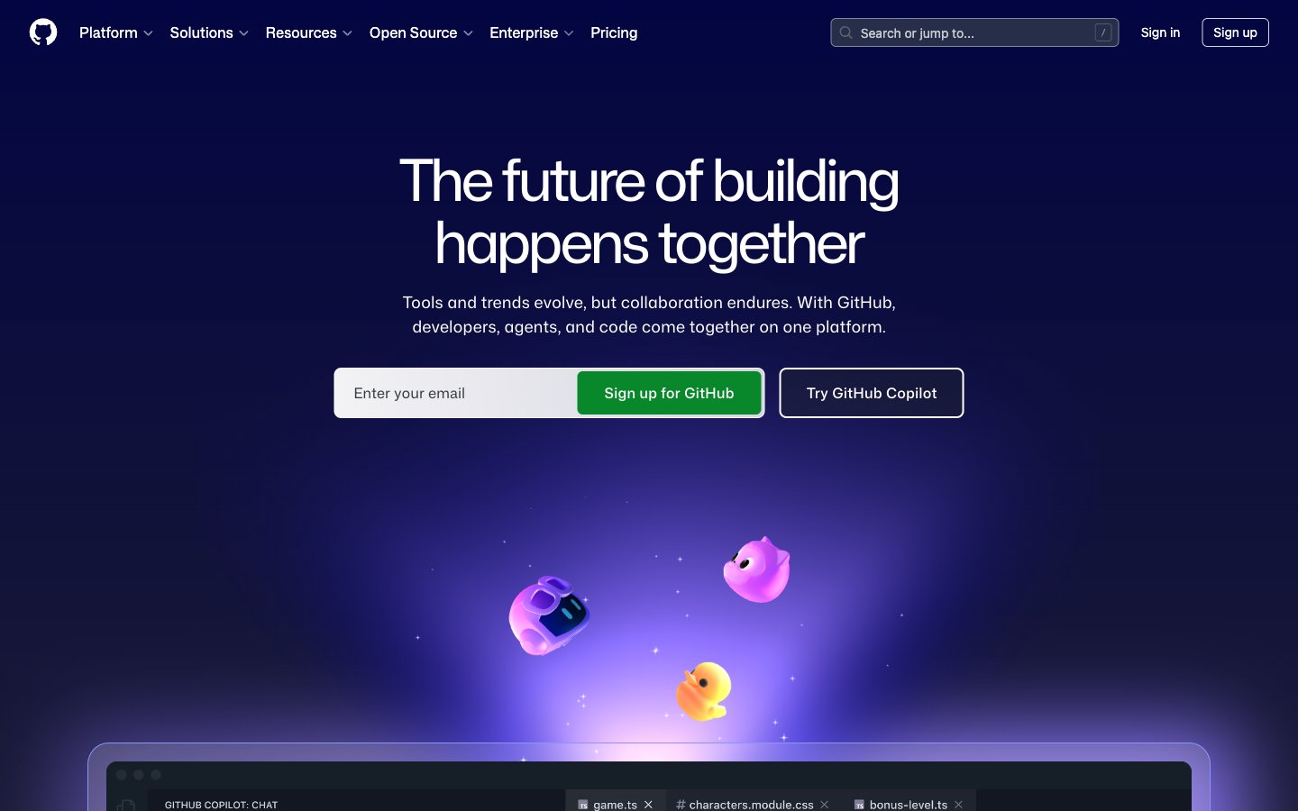
Midnight command center, subtly glowing
Colors
#0d1117 Primary page background, base for most dark surfaces
#000000 Elevated surfaces, code blocks, modal backgrounds, and deeply shadowed areas
#151a22 Secondary background for sections, code editor areas, and subtle surface differentiation
#21262d Borders between sections, divider lines, and very soft visual separation
#283041 Faint background for inactive states or subtle borders, hinting at elevation
#ffffff Primary text, prominent icons, and active navigation elements. Also used as a white background for some translucent elements
#f0f6fc Secondary text, subheadings, and muted UI elements that require slightly less prominence than primary text
#9198a1 Placeholder text, secondary icons, and less prominent text labels
#7c8980 Subtle helper text, less important details, and desaturated captions
#8dd6ff Link text, outlined button borders, and interactive icon accents. It's a key brand identifier for interactive elements
#08872b Primary action button background. Signals positive action or confirmation
#8c93fb Decorative card borders and subtle illustrative accents, creating a sense of digital magic
#5fed83 Highlight text or decorative elements, particularly within code or feature descriptions
#1f6feb Solid background for specific active elements or content blocks, providing a stronger visual presence
#e6b7fe Illustrative element — background highlight for abstract graphics
#a7a2ff Illustrative element — focused glow emanating from central points in graphics
#5993d4 Illustrative element — upward-sweeping light beams in abstract backgrounds
#000240 Illustrative element — beginning of a deep blue gradient for background effects
Do
- Prioritize Deep Space (#0d1117) as the canvas background for most page sections.
- Use Ghost White (#ffffff) for all primary body and heading text for maximum contrast on dark backgrounds.
- Apply Spring Green (#08872b) exclusively for primary call-to-action button backgrounds.
- Utilize Polar Blue (#8dd6ff) for all links, outlined buttons, and interactive icons.
- Apply a 6px border radius for most interactive elements like buttons and inputs, but use 60px for pill-shaped elements.
- Ensure cards use a larger 24px border radius, often with only top corners rounded for a more architectural feel.
- Maintain comfortable element spacing using multiples of 4px, especially 16px for elementGap.
Don't
- Avoid using bright, saturated colors for backgrounds; stick to the dark neutral palette.
- Do not use generic gray borders (such as #f0f6fc) on interactive elements; Polar Blue (#8dd6ff) is reserved for interaction outlining.
- Never introduce hard, sharp corners on cards or primary buttons; maintain a consistent rounded aesthetic.
- Do not use overly large or decorative drop shadows; the system favors subtle glows and translucency over heavy elevation.
- Avoid dense packing of information; allow ample `elementGap` and `sectionGap` for a comfortable user experience.
- Do not vary font families outside of Mona Sans variants and monospace fallbacks; maintain typographic consistency.
- Avoid using Mona Sans Mono or ui-monospace for non-code content; these are specifically for technical text.