PUBLIC REFERENCE
True Staging
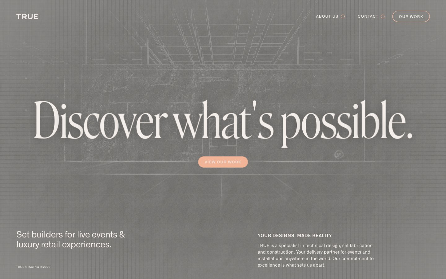
Architectural blueprint on aged parchment
Colors
Blueprint Canvas
#111111 Page background, primary dark text, subtle borders — grounds the design in a deep, almost charcoal base
Parchment White
#f5efeb Primary light text, ghost button borders, accents within a darker canvas — suggests a tactile, natural paper texture
Amber Peach
#f1b497 Orange outline accent for tags, dividers, and focused UI edges. Do not promote it to the primary CTA color
Do
- Always use Blueprint Canvas (#111111) for page backgrounds and primary dark text.
- Apply Parchment White (#f5efeb) for primary light text on dark backgrounds and for ghost button borders.
- Reserve Amber Peach (#f1b497) for key accents, selected navigation highlights, and the primary 'Our Work' button fill.
- Employ Roslindale (sub: Playfair Display) for large, expressive headlines (158px, weight 300, ls -0.0200em) to convey gravitas.
- Utilize Alliance (sub: Inter) for all functional text, varying weights (400, 500, 600) and sizes (9px, 12px, 14px) as needed for hierarchy.
- Implement an 80px border-radius for all interactive elements like buttons and navigation items to maintain a consistent soft, pill-like shape.
- Maintain a compact spacing density, with an element gap of 8px and section vertical spacing of 53px.
Don't
- Do not introduce bright, vibrant colors; maintain the muted, earthy palette of Blueprint Canvas, Parchment White, and Amber Peach.
- Avoid sharp, angular corners; consistently apply the 80px border-radius for all applicable UI elements.
- Do not use generic system fonts for display headings; Roslindale's unique character is central to the brand's sophisticated feel.
- Avoid excessive use of elevation or heavy shadows; the system relies on subtle borders and color shifts for separation.
- Do not deviate from the defined letter-spacing values for Alliance; precise tracking is essential for its compact appearance.
- Do not use Parchment White (#f5efeb) on amber backgrounds due to insufficient contrast (1.6:1 ratio).
- Avoid making any element overtly 'loud'; the design emphasizes understated luxury through subtle contrasts and refined details.