PUBLIC REFERENCE
Mario Carrillo
Vibrant gradient canvas
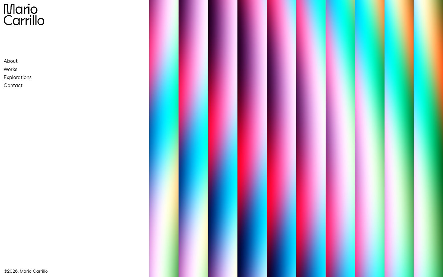
Colors
Canvas White
#ffffff Page backgrounds, left-hand navigation pane background
Ink Black
#000000 Primary text, navigation links, borders, logo fill
Scarlet Flash
#de3333 Animated navigation background segment within the gradient
Ocean Dream
#70b2ff Animated navigation background segment within the gradient
Emerald Glaze
#7bdcb5 Animated navigation background segment within the gradient
Golden Burst
#f9bf03 Animated navigation background segment within the gradient
Do
- Prioritize a stark white background (#ffffff) for all UI content on the left pane and use Ink Black (#000000) for all text and UI outlines.
- Use StudioFeixenSans (or Montserrat) at weight 400 for all textual content, adhering to minimal letter spacing.
- Introduce dynamic color via full-bleed gradient sections that contrast sharply with static UI elements. These gradients should feature vivid brand colors like Scarlet Flash (#de3333), Ocean Dream (#70b2ff), Emerald Glaze (#7bdcb5), and Golden Burst (#f9bf03).
- Maintain a compact density for UI elements, utilizing a base spacing unit of 6px and minimal gaps like 5px between navigation items.
- Ensure the logo is prominent black text (#000000) against the white canvas, consistent with the typographic style.
- Implement interactive states for navigation items by applying one of the distinct brand colors as a solid background fill on hover, ensuring high contrast with the black text.
Don't
- Avoid using multiple font families or weights beyond 400 (StudioFeixenSans) to maintain typographic consistency.
- Do not introduce shadows or complex elevation schemes, as the design relies on flat surfaces and high contrast.
- Refrain from using muted or desaturated colors for UI elements; chromatic colors should be vivid and high-impact when used.
- Do not use iconography or other decorative elements that could detract from the strong contrast and gradient visual.
- Avoid excessive padding or large empty spaces within the UI content area; maintain a concentrated, information-dense display for text.
- Do not break the full-bleed nature of the gradient sections with contained content or overlays that obscure their vibrancy.