PUBLIC REFERENCE
Ramp
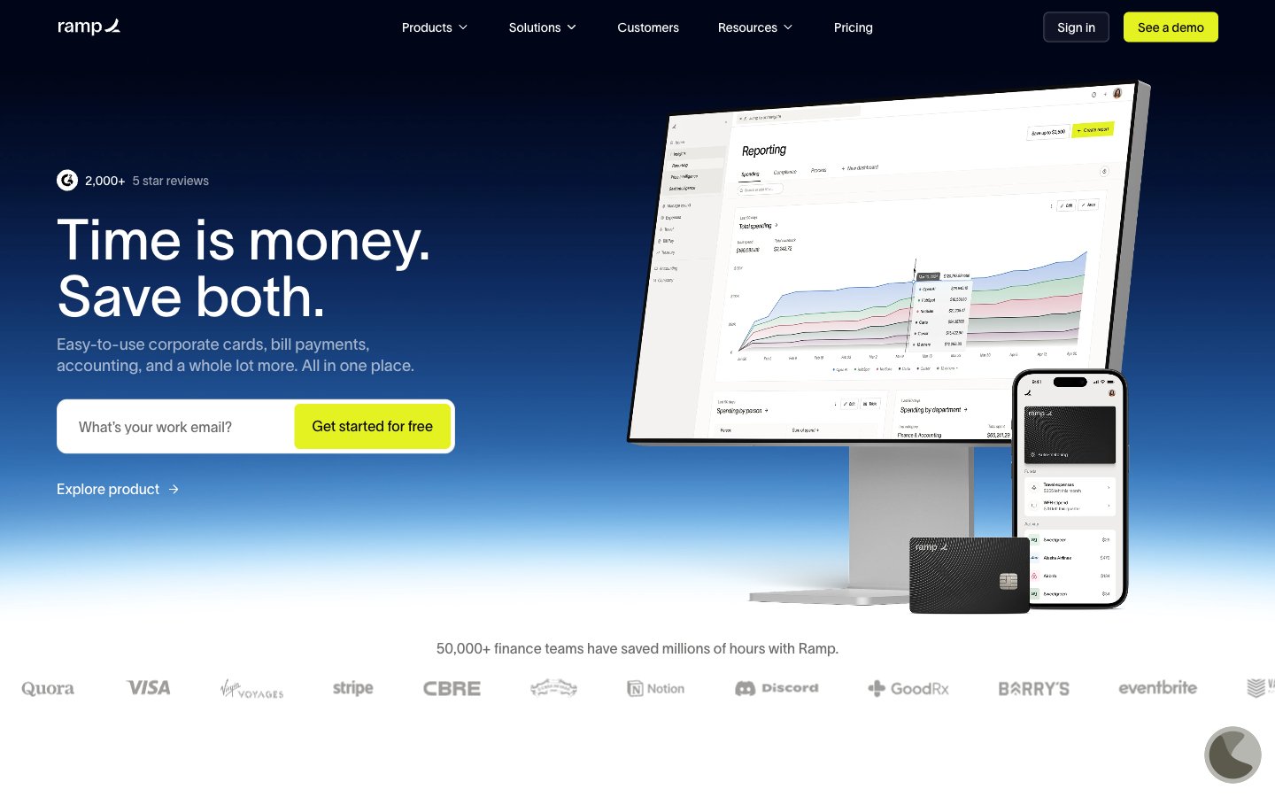
Deep Ocean Command Center – a stark, high-contrast control panel set against an endless dark expanse.
Colors
#0c0a08 Primary page background, base surface for components — establishes the dark theme depth.
#ffffff Primary text color, crucial for high contrast readability against dark backgrounds, interactive element text.
#1a1919 Secondary surface background, used for lifted cards or subtle section breaks against the primary background.
#000000 Illustrative elements, icons, and occasionally deeper backgrounds for visual breaks.
#f4f2f0 Alternate background for specific white-themed cards or content sections, offering high contrast to deep blacks.
#999ba3 Subtle text, inactive states, faint borders, and muted icons.
#4d505d Input field borders, secondary structural elements.
#010412 Subtle shadow color, creating depth on dark surfaces without being stark.
#0b0d1b Darkest button backgrounds, creating a sense of subtle elevation within the dark theme.
#d2cecb Light borders and dividers for cards and sections on lighter neutral backgrounds.
#e4f222 Primary calls to action, active navigation indicators, and key interactive elements. Provides strong visual focus.
#00d638 Success states, positive indicators, and specific illustrative elements.
#5683d2 Link text, informational elements, and subtle brand accents.
#0066ff Interactive elements, graphical accents with high visibility.
#ff492c Highlighting specific features or drawing attention to warnings.
Do
- Prioritize text legibility by using Pure White (`#ffffff`) for primary text on Deep Space Black (`#0c0a08`) or Ocean Abyss (`#0b0d1b`) backgrounds.
- Use Sunbeam Yellow (`#e4f222`) exclusively for primary call-to-action buttons and active navigation states to clearly signal interaction points.
- Apply 12px border-radius to all cards and larger container elements for a consistent soft-edged feel.
- Maintain a clear visual hierarchy by utilizing the surface progression: Deep Space Black (`#0c0a08`) for canvas, Ash Gray (`#1a1919`) for elevated cards, and Ocean Abyss (`#0b0d1b`) for interactive elements on dark backgrounds.
- Ensure headings use the 'lausanne' font with its 'ss01' font feature for precise number and character alignment, crucial for financial data.
- Use 8px as the default `elementGap` for consistent spacing between UI elements, reserving smaller increments for fine-tuning dense interfaces.
- For all navigation and buttons, apply a 4px border-radius to create a distinct, slightly softer interaction target.
Don't
- Do not use Sunbeam Yellow (`#e4f222`) for decorative purposes or non-interactive elements, as it dilutes its primary CTA role.
- Avoid arbitrary color choices; every color must map to a defined role within the palette to maintain cohesion.
- Do not introduce new shadow styles; adhere to the subtle inset white shadow (`rgba(255, 255, 255, 0.6) 0px 0px 2px 0px inset`) for nav and the default no shadows for cards.
- Do not use generic system fonts for primary UI text; always prefer 'lausanne' with its 'ss01' feature for brand consistency and precision.
- Avoid varying component padding; stick to the specified padding for buttons (e.g., 10px vertical, 20px horizontal) and cards (e.g., 24px for outlined cards) to maintain rhythmic spacing.
- Do not use pure black (`#000000`) for extensive text; reserve it for illustrative elements or very specific, high-contrast contexts.