PUBLIC REFERENCE
LottieFiles
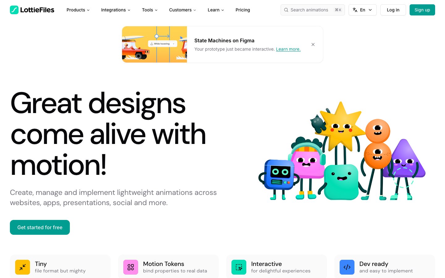
Playful Precision amidst Animation; a digital canvas vibrant with motion, grounded by clear, spacious layouts.
Colors
#ffffff Page background, primary surface color for cards and interactive elements.
#fafafa Slightly off-white background where subtle contrast is needed, input fields, subtle section dividers.
#e4e4e7 Subtle borders, dividers, outlines for card elements.
#f4f4f5 Secondary background for sections, muted buttons.
#09090b Primary text, prominent headings, strong contrast elements.
#18181b Hover states for dark text, occasionally as button background.
#71717b Secondary text, icons, muted brand elements.
#9f9fa9 Fainter text, placeholder text, disabled states.
#019d91 Primary call to action buttons, active navigation indicators, key brand accents. This moderate teal provides a fresh, energetic touch without being overly aggressive.
#00ddb3 Used within illustrations and occasionally for very bold accent elements, appearing brighter than Lottie Teal.
#f0b100 Highlighting specific elements in illustrations, secondary accent color for badges or notifications.
#3a86ff Used for specific interactive elements in illustrations, providing a bright, modern accent.
#94d19f A softer green, used primarily inside illustrations to add to the playful aesthetic.
#ff8eed A vibrant pink used in illustrations for character elements and other playful accents.
Do
- Prioritize DM Sans for headlines (sizes > 24px) with specific letter-spacing as defined in typography, using Carbon Black (#09090b) for high impact.
- Use Lottie Teal (#019d91) exclusively for primary calls to action, maintaining its distinctive brand presence.
- Apply rounded corners consistently: 12px for buttons, 16px for cards, and 24px for larger visual elements like image containers to reinforce approachability.
- Maintain generous spacing with elementGap at 8px, 16px, or 24px, and sectionGap between 40-80px to ensure visual comfort and focus.
- Employ the subtle shadow rgba(0, 0, 0, 0.05) 0px 1px 2px 0px for all elevated cards and interactive elements, adding minimal depth.
- Utilize Inter font at 14px or 16px for all body text, links, and UI labels, ensuring high readability with a default letter-spacing of -0.01em.
- Ensure adequate contrast: Carbon Black (#09090b) on Cloud White (#ffffff) or Ash White (#fafafa) for all primary text content.
Don't
- Avoid applying excessive shadows; stick to the single, subtle shadow defined for elevation.
- Do not introduce new chromatic colors outside of the defined brand and accent palette; maintain the vibrant teal focus with select pops of yellow/blue.
- Refrain from using sharp corners or radii smaller than 8px for interactive elements; the visual style leans into softer, friendlier shapes.
- Do not use DM Sans for large blocks of body text; reserve it for headlines and short, impactful statements to preserve its distinctive role.
- Avoid dense, information-heavy sections without adequate white space; prioritize breathability and comfortable reading experiences.
- Do not deviate from the specified dark neutral colors for primary text and headings; maintain high contrast and legibility.
- Do not use Lottie Teal (#019d91) for body text or non-interactive elements; keep it reserved for key actions and brand accents.