PUBLIC REFERENCE
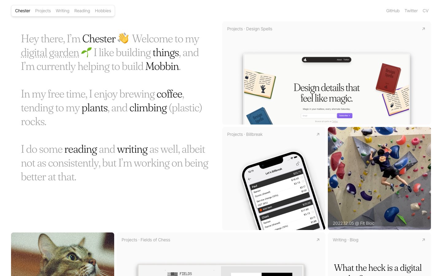
Chester's Garden
Digital garden journal: crisp pages, intimate handwriting, and colorful bookmarks.
Colors
#fafafa Major surface background, card backgrounds.
#e5e7eb Default borders, subtle separators, background for non-interactive elements.
#171717 Primary text color for headings and prominent links.
#000000 Strongest text contrast, used for body text and navigation links.
#a3a3a3 Secondary text, disabled states, supporting icons.
#7c2d12 Used for 'READ' tags, indicating intellectual content — a warm, inviting educational cue.
#fdd3b1 Soft background for 'READ' tags, providing gentle visual emphasis.
#581c87 Specific content type indicators like 'Writing' or 'Projects'.
#e6cefe Soft background wash for 'Writing' or 'Projects' tags.
#0c4a6 Specific content type indicators, e.g., 'Projects' or 'Hobbies'.
#afe5fc Soft background wash for 'Hobbies' tags.
#365314 Specific content type indicators, e.g., 'Plants' or active states.
#daf5ae Soft background wash for 'Plants' tags.
Do
- Prioritize 'Fraunces' for all headings and short, impactful statements to leverage its elegant, light-weight character.
- Use 'Inter' 16px weight 400 for all paragraph text, maintaining a consistent, highly readable, and unobtrusive voice.
- Apply #fafafa as the primary background color for all main content areas to create a bright, airy canvas.
- Utilize #e5e7eb for subtle borders and background for non-interactive list items or dividers, maintaining visual softness.
- Employ 8px border-radius for all content cards and larger UI elements, balancing subtle softness with structure.
- Apply 9999px border-radius to all interactive tags and buttons, creating a distinct pill shape that signals interactivity.
- Use accent colors (e.g., #7c2d12, #581c87, #0c4a6, #365314) and their light background variants consistently for content categorization, acting as visual cues like colored labels.
- Apply minimal inset shadow rgba(0, 0, 0, 0.1) 0px 0px 0px 1px inset, rgba(0, 0, 0, 0.1) 0px -2px 0px 1px inset to card backgrounds, giving them a subtle definition without heavy lifting.
Don't
- Avoid bolding or using heavier weights for 'Fraunces'; its impact comes from its lightness (weight 300).
- Do not use highly saturated colors for large blocks of content; reserve them for small, intentional accents only.
- Refrain from introducing strong drop shadows; the design relies on subtle inset shadows for depth or light elevation for images (rgba(0, 0, 0, 0.1) 0px 10px 15px -3px, rgba(0, 0, 0, 0.1) 0px 4px 6px -4px).
- Avoid using multiple border-radii values for a single component type; maintain consistency (e.g., tags are always 9999px).
- Do not use #000000 for body text unless higher contrast is explicitly required, #171717 or #a3a3a3 are preferred for a softer read.
- Do not vary letter spacing from the defined values; 'Inter' at -0.4px and 'Fraunces' at -0.9px letter-spacing are critical to the typographic feel.
- Avoid generic hover states like simple color changes for interactive elements; opt for underlines on links or distinct background changes for buttons/tags.