PUBLIC REFERENCE
Apple
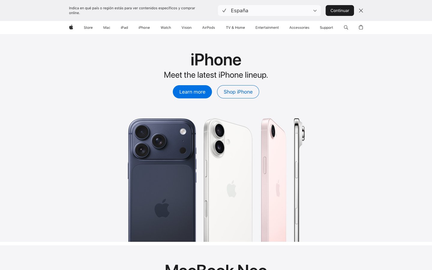
Polished lens on innovation — clear, precise, and understated.
Colors
#1d1d1f Primary text, headline text, glyphs, and navigation elements. Near-black for maximum contrast on light backgrounds.
#333333 Secondary text and navigation elements, slightly softer than primary text.
#474747 Link text and navigation link text, indicating interactive elements.
#707070 Tertiary text, footer text, and subtle UI elements. Softer body copy.
#858585 Muted text for less prominent information, icon fills.
#c7c7c7 Subtle image box shadows, creating depth without heavy obscuration.
#d6d6d6 Thin, crisp border lines for UI separation.
#e2e2e5 Subtle background for UI components, hinting at separation.
#f5f5f7 Dominant page background, primary canvas for content. The foundational light surface.
#ffffff Elevated UI elements, such as navigation backgrounds or contained content blocks, contrasting subtly with the primary canvas.
#000000 Icon fills and occasional headline accents, providing maximum visual punch where needed.
#0071e3 Primary interactive element background, such as filled buttons and focus rings. A vivid, clear blue that signifies action.
#0066cc Link color for interactive text and outline buttons. Slightly darker than Interactive Blue for text hierarchy.
#2997ff Vivid blue for interactive states, highlighting links, buttons, and other active elements. Creates a bright, inviting focus.
#3397d4 Secondary accent color, used in specific graphic elements or backgrounds to provide visual variation.
#9fc6f4 Muted background for specific content sections, providing a soft color block.
#ec893c Accent color for specific products or promotional blocks, providing a warm, energetic contrast.
#7424b5 Accent color for distinct content blocks, especially in content-rich sections like Apple TV.
Do
- Prioritize SF Pro Display for headlines (21px and up) with its specific letter spacing and 'numr' feature for numeral alignment.
- Use SF Pro Text for all body copy, UI labels, and navigation elements, leveraging different weights for hierarchy (e.g., 300 for captions, 400 for body, 600 for important labels).
- Apply 980px border-radius for all primary and secondary buttons, ensuring a consistent pill-shape aesthetic.
- Utilize Interactive Blue (#0071e3) as the default background for interactive elements and Action Blue (#0066cc) for link text.
- Maintain a clear visual hierarchy using the neutral color scale: Midnight Graphite (#1d1d1f) for primary text, Deep Gray (#333333) for secondary, and Medium Gray (#707070) for tertiary.
- Frame product imagery tightly, allowing the product to be the central visual element without excessive padding or decorative borders.
- Implement the 10px element gap for consistent vertical spacing between UI items and 15px card padding where applicable for internal content.
Don't
- Avoid using harsh drop shadows; instead, suggest elevation through subtle background color shifts (e.g., Canvas White to Pure White) and a very light box-shadow like rgba(0, 0, 0, 0.22) 3px 5px 30px 0px for images.
- Do not deviate from the established pill-shape radius for buttons; rounded rectangles or sharp corners are reserved for specific components like image containers (8px).
- Refrain from using heavily saturated colors for backgrounds unless it is a specific accent area or product showcase as defined by the accent palette.
- Do not introduce decorative borders or heavy strokes around primary content blocks or cards; opt for clean edges or subtle background shifts.
- Avoid excessive letter spacing on body or caption text; maintain the precise, optically balanced tracking values defined in the typography section.
- Do not use generic system default link styles; ensure all links use Action Blue (#0066cc) and inherit SF Pro Text styling.
- Do not introduce extraneous visual elements that compete with product imagery; the UI should be understated and serve to highlight the content.