PUBLIC REFERENCE
Revolut
financial passport to the world
Colors
Revolut Black
#191c1f Primary text, dark CTA backgrounds, footers, borders. Establishes a deep, serious foundation.
Cloud White
#f4f4f4 Primary light CTA backgrounds, some page sections. A soft off-white that feels less stark than pure white.
Pure White
#ffffff Primary page background, text on dark surfaces.
Onyx Black
#000000 Text on light CTA buttons, some secondary CTA backgrounds.
Slate Gray
#8d969 Secondary body text, disabled states, helper text.
Ash
#505a63 Tertiary text, subtle UI elements.
Pebble
#c9c9cd Borders and dividers.
Light-Tint
#ebebf0 Subtle button backgrounds and hover states.
Do
- Use Aeonik Pro with significant negative letter-spacing for all display and headline text.
- Restrict the palette almost exclusively to white (#ffffff), off-white (#f4f4f4), black (#000000), and near-black (#191c1f).
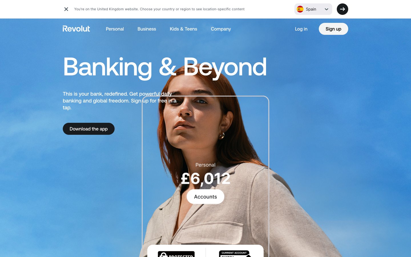
- Employ full-bleed, cinematic photography for all hero sections.
- Always use 9999px radius pill-shaped buttons for primary and secondary actions.
- Center-align all headline and sub-headline text blocks within their sections.
- Juxtapose full-bleed photo sections with stark, solid #ffffff background sections.
- Maintain generous vertical whitespace (96px+) between major page sections.
Don't
- Do not introduce any saturated brand or accent colors. The photos provide the only color.
- Do not use box-shadows for elevation. The design is intentionally flat.
- Do not use traditional, sharp-cornered (e.g., 4px-8px radius) buttons.
- Do not use system fonts like Arial or Helvetica for headlines; it will break the brand identity.
- Do not left-align hero content. The centered stack is a core pattern.
- Do not use complex card layouts. Keep content blocks simple and direct.
- Do not make content containers full-width; use the 1200px max-width for readability.