PUBLIC REFERENCE
Sociotype
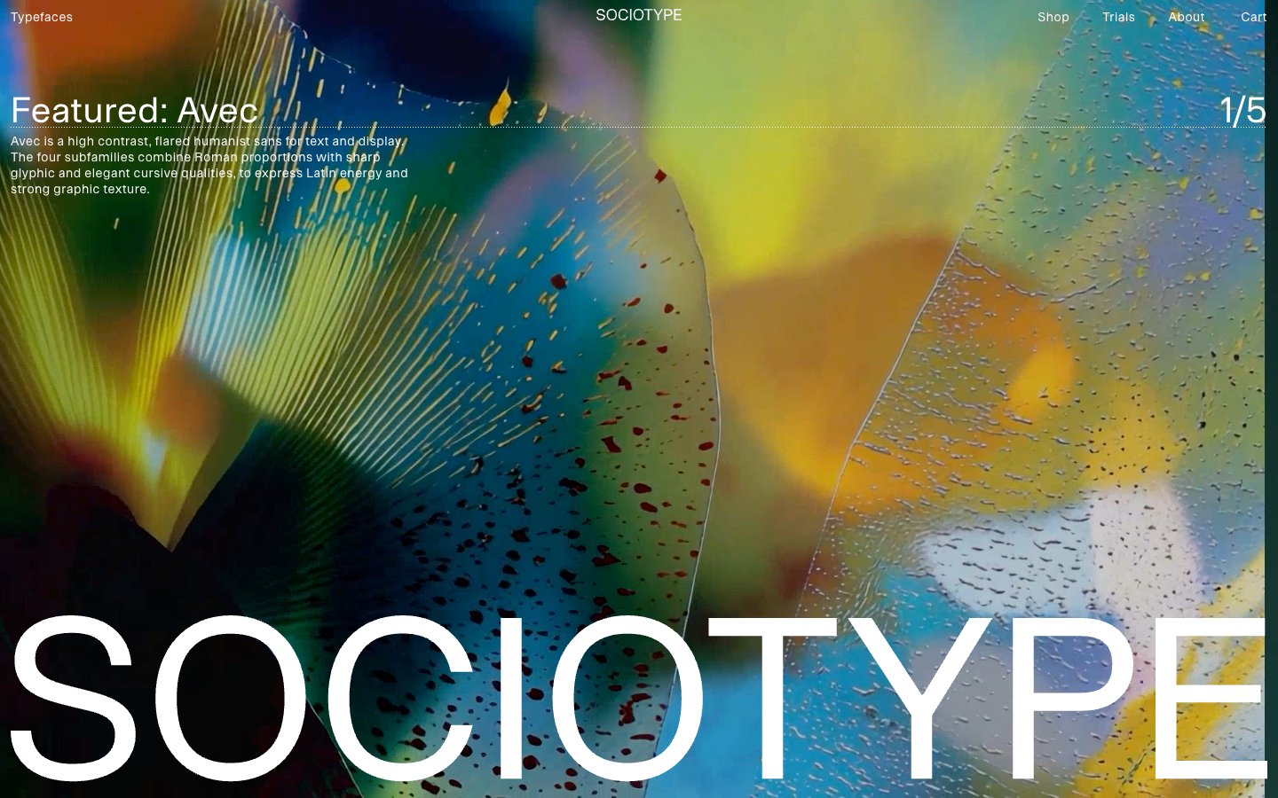
Editorial White Canvas
Colors
Canvas White
#ffffff Page backgrounds, card surfaces, primary text on dark hero sections
Ink Black
#000000 Primary text, borders, active states for ghost buttons and navigation, accent markings
Medium Gray
#818181 Muted text, secondary information, placeholder text, inactive link borders
Light Gray
#d6d6d6 Subtle dividers, borders between content sections
Faded Gray
#9d9d9d Tertiary text, list item borders
Do
- Prioritize Ink Black (#000000) for all primary text and interactive element outlines on default light backgrounds.
- Use Canvas White (#ffffff) as the dominant page, card, and footer background, establishing a clean, expansive aesthetic.
- Maintain a strict 0px border-radius for all components, including buttons, cards, and input fields, for a sharp, precise feel.
- Implement interactive elements primarily as ghost buttons or underlined text, with minimal visual styling beyond color and text decoration transitions.
- Structure content with ample vertical spacing, leveraging the implied section gap of 120px to create distinct content blocks.
- Employ the Onsite font for all functional text under 'display' sizes, ensuring consistency in body, navigation, and button labels.
- Utilize Avec Sharp, Ceno, Meso, Gestura, or Rework fonts exclusively for large, impactful display typography to showcase different font characteristics.
Don't
- Avoid using saturated background colors or heavy fills for interactive elements; stick to the achromatic palette.
- Do not introduce shadows or significant elevation on cards or buttons; elements should appear flat against the canvas.
- Refrain from applying rounded corners to any UI elements; all corners should be sharp 0px radius.
- Do not use highly contrasting accent colors for calls to action; rely on text weight, size, and subtle border changes for emphasis.
- Avoid dense, clustered layouts; allow generous empty space around content sections and individual elements.
- Do not deviate from the specified typefaces Onsite, Avec Sharp, Ceno, Meso, Gestura, or Rework; no other typefaces are part of this system.
- Do not use generic system fonts or default browser styles for links; ensure all interactive text uses the defined ghost button or underlined styles.