PUBLIC REFERENCE
Hyperstudio
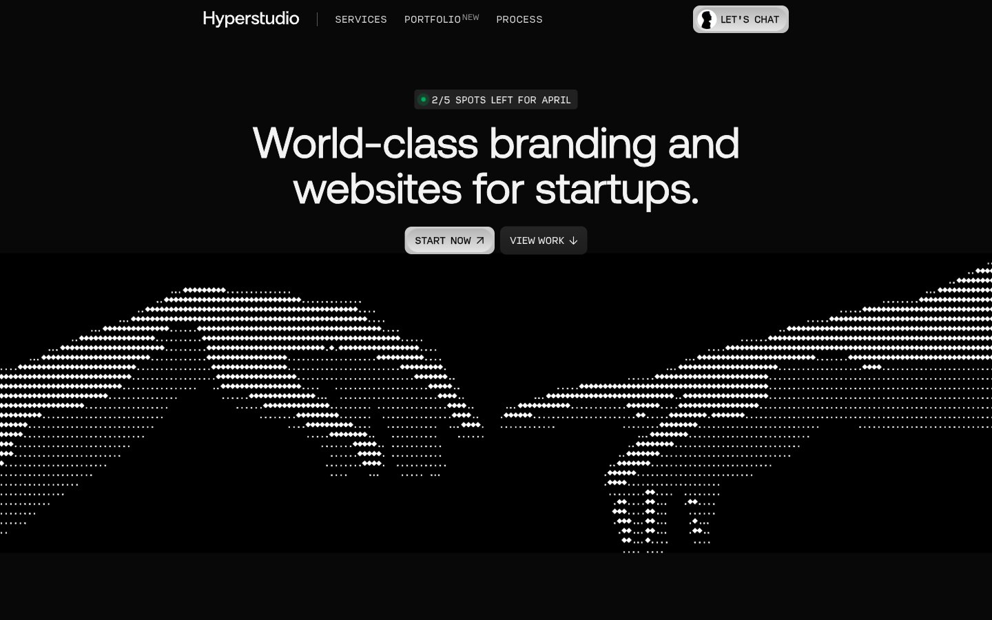
Monochrome terminal with amber accents. The design feels like a precisely coded interface, where every element serves a distinct, functional purpose against a dark, featureless backdrop.
Colors
#101010 Primary page background, deepest dark surface.
#080808 Secondary background, slightly darker than Midnight Void, used for subtle depth.
#F3F3F3 Primary text color, hero headlines, clear contrast against dark backgrounds.
#FFFFFF Accent text and background for interactive elements like buttons, header text.
#949494 Secondary text, subtle borders, slightly toned down from main text.
#333333 Border colors, muted backgrounds for secondary elements.
#C1C1C1 Subtle borders, outlines, dividers.
#B5B5B5 Subtle background gradient for UI elements, providing a soft, almost imperceptible texture.
#E7C59A Key accent color for interactive elements, 'NEW' tags, drawing attention in a restrained way appropriate for a tech brand.
#00AC5C Small status indicators, 'spots left' tags, indicating positive status or availability.
Do
- Prioritize high contrast between text and background, typically Polar White (#F3F3F3) on Midnight Void (#101010) or Absolute Zero (#FFFFFF) on Dark Carbon (#333333).
- Use Aeonik at size 63px, weight 700, and lineHeight 0.95 for primary display headlines to maintain a commanding yet compact presence.
- Employ Amber Glow (#E7C59A) exclusively for key attention-grabbing elements, such as 'NEW' labels or critical status indicators.
- Maintain a default border radius of 8px for most interactive elements and cards, using 99px only for circular or pill-shaped tags.
- Utilize Input font for any content that benefits from a monospace, data-like presentation, especially at -0.037em letter spacing for specific technical details.
- Structure layouts with ample section-gap (64px) to create a spacious, breathable feel between content blocks despite the dark theme.
- Employ Neon Green (#00AC5C) to denote positive status, availability, or success, ensuring it stands out as an unambiguous indicator.
Don't
- Do not introduce additional vibrant colors; stick to Amber Glow (#E7C59A) and Neon Green (#00AC5C) as the only chromatic accents.
- Avoid using drop shadows for elevation; rely on varied shades of dark neutrals like Midnight Void (#101010) and Deep Space (#080808) for depth perception.
- Do not deviate from the specified tight line-heights for headlines, as they are crucial for the dense, impactful typographic style.
- Do not use generic system fonts; Aeonik and Input are essential to the brand's distinctive technical aesthetic.
- Avoid excessive rounding; maintain sharp or subtly rounded corners (8px) for most UI elements, reserving pill shapes for specific tags.
- Do not use full-width background images that break the defined dark background color palette; visual interest comes from typographic treatment and data visualization.