PUBLIC REFERENCE
Perplexity AI
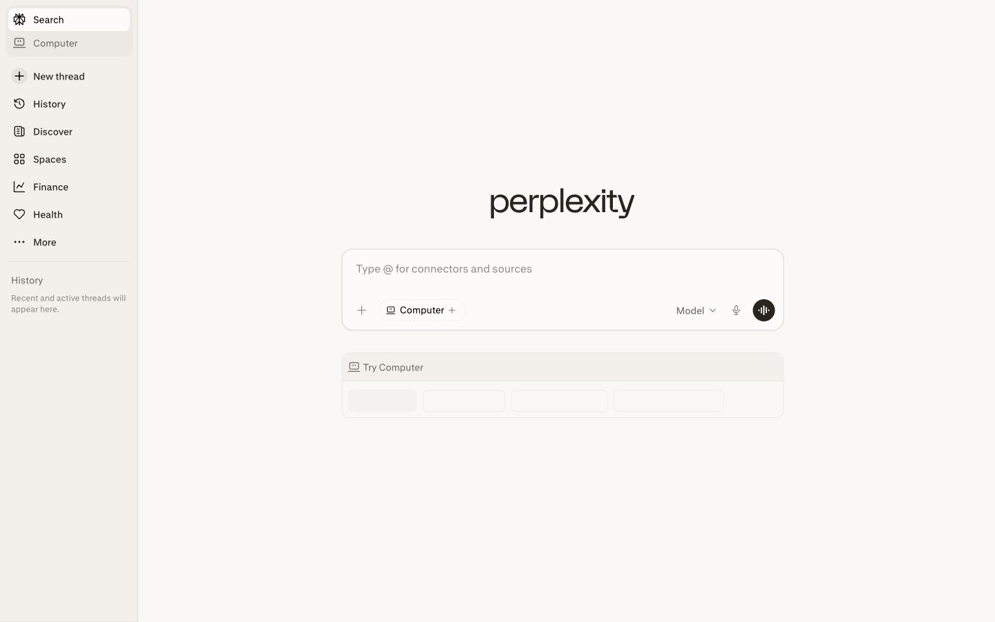
Ivory Desk, Graphite Tools — a pristine, brightly lit workspace filled with essential gray instruments.
Colors
#000000 Primary text, interactive icons, active states – commands immediate attention against the subtle backgrounds.
#FFFFFF Main page background, pristine canvas for content. The brightest neutral.
#FAF8F5 Interactive element backgrounds like search bars and buttons in inactive states, providing a soft contrast to the main background.
#27251 Secondary text, subtle backgrounds for elevated elements, and borders for input fields – registers as dark but softer than pure black.
#92918B Placeholder text, subtle contextual information, providing low-contrast visual guiding.
#72706B Tertiary text, inactive icons, divider lines – defines softer visual cues and non-critical information.
Do
- Prioritize Graphite (#27251E) for secondary text and subtle UI elements to maintain a restrained aesthetic.
- Use Paper White (#FFFFFF) as the predominant background, with Parchment (#FAF8F5) for interactive surfaces to create depth without strong shadows.
- Apply 9999px border-radius to all interactive buttons and tags for a distinctive pill shape.
- Maintain 8px border-radius for input fields and active navigation items to denote interactive, contained elements.
- Use Inkwell (#000000) exclusively for primary text and critical interactive icons for maximum clarity and contrast.
- Ensure 4px vertical padding for list items and 8px for internal element gaps to maintain a compact density.
- Use the `pplxSans` font at weight 400 for all body and informational text for consistent tone.
Don't
- Avoid chromatic colors; this system relies exclusively on shades of gray and off-white.
- Do not use box-shadows that are anything other than extremely subtle; surface differentiation comes from color variants, not elevation.
- Do not introduce square buttons or elements if they contain interactive copy or serve as primary actions; use the 9999px radius.
- Do not vary font families; stick strictly to `pplxSans` (or 'Inter') for all typographic elements.
- Do not use font weights other than 400 or 500.
- Avoid large spacing values; the design emphasizes information density with 4px and 8px increments.