PUBLIC REFERENCE
Ferrari
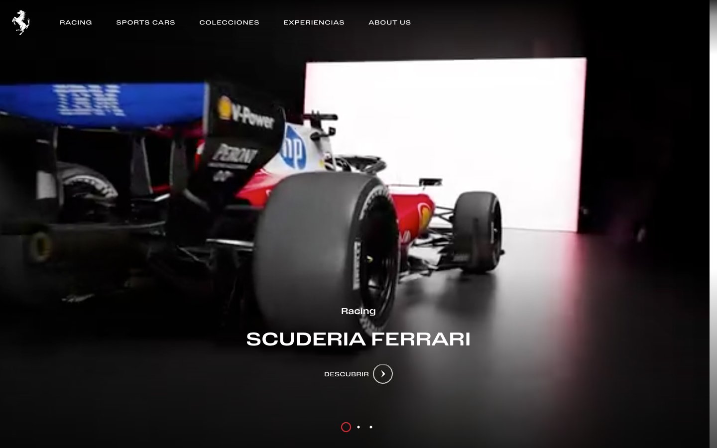
Precision engineered machinery. Like the interior of a sleek, high-performance engine, where every component is black or silver, and only critical indicators glow red.
Colors
#000000 Page backgrounds, navigation bars, dramatic photographic backdrops for product showcases.
#ffffff Primary text, prominent page sections, content cards, and interactive elements – providing crisp contrast against dark backgrounds.
#181818 Secondary text in navigation, footer elements, and subtle background shading to create depth without overt shadows.
#303030 Minor dividers, borders, and backgrounds for less prominent UI elements, establishing a subtle hierarchy within dark themes.
#8f8f8f Supportive text, icon fills, and subtle hints where softer contrast is desired, such as secondary information or disabled states.
#FF0000 Accent color for interactive elements, progress indicators, underlines on active navigation items - the iconic visual signature of the brand, used sparingly for impact.
Do
- Do utilize a high-contrast palette of `Obsidian Black` (#000000) and `Polar White` (#ffffff) as the primary background and text colors to maintain a dramatic and luxurious feel.
- Do apply `Rosso Corsa` (#FF0000) as the sole accent color, reserving it exclusively for interactive elements and key indicators to command attention.
- Do apply custom `Body-Font` with generous letter-spacing (e.g., 0.0830em for navigation) for headlines and navigation to emphasize precision and exclusivity.
- Do use a 'comfortably spaced' rhythm with `elementGap` of `10px` and `cardPadding` of `20px` to maintain order and focus.
- Do maintain sharp, `0px` radius on all interactive elements and containers to reinforce the engineered aesthetic.
- Do use the `Shadow Graphite` (#181818) and `Steel Gray` (#303030) as subtle surface variations rather than relying on drop shadows for depth.
Don't
- Don't introduce additional chromatic colors; the system is built on a black-and-white foundation with a single `Rosso Corsa` accent.
- Don't use rounded corners or soft edges on any components; the design demands sharp, precise lines (`0px` radius).
- Don't use drop shadows for elevation; rely on shifts in neutral background colors (`#000000`, `#181818`, `#ffffff`) to create hierarchy and depth.
- Don't use tight letter-spacing; the custom `Body-Font`'s inherent wide spacing is a core part of the brand's typographic identity.
- Don't embed images with external context; use tightly cropped, abstract, or studio-shot product imagery that isolates the subject.
- Don't deviate from the `Body-Font` for text elements; the system relies on this single typeface for typographic consistency and brand identity.