PUBLIC REFERENCE
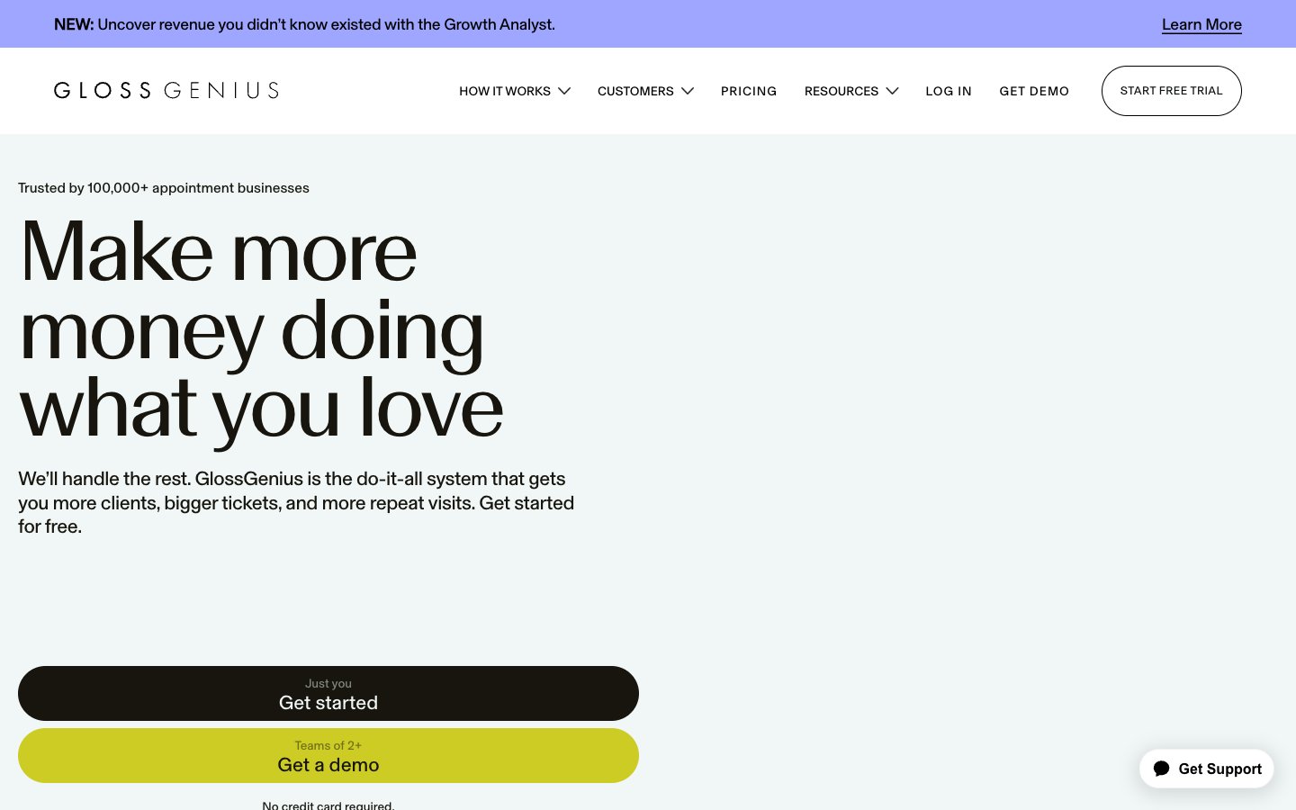
All-In-One Salon
Crisp digital ledger, with neon highlights guiding the way.
Colors
#17150 Primary text, headline text, dark background sections, button backgrounds. This deep near-black provides strong contrast and a sense of premium quality.
#ffffff Main page background, card backgrounds, text on dark backgrounds. Dominates the canvas for a bright, open feel.
#f0f7f6 Secondary background color for sections, card hover states, badge backgrounds. Offers a subtle variation from pure white for content differentiation.
#000000 Navigation text, icons, button outlines. Used for the sharpest contrast elements, often interactive.
#e2e2e2 Subtle borders and dividers for section separation.
#cccc25 Calls to Action, active state indicators. This vibrant yellow gives an immediate energetic and positive feel.
#cccc25 Decorative backgrounds and possibly interactive elements, offering a subtle shift in luminescence for visual interest.
#9fa6ff Promotional banners, card backgrounds, accent areas. This vivid violet provides a playful, modern contrast to the muted neutrals.
#9fa6ff Backgrounds for features or promotional blocks, adding depth and visual softness.
Do
- Prioritize Basel Grotesk Book for all functional text: 400 weight for body, 500 for subheadings and buttons, 600 for important UI labels.
- Utilize 1440px border-radius for interactive elements like buttons and tags, creating a soft, inviting touch across the UI.
- Use Porcelain Gray (#f0f7f6) as a subtle background differentiator for content blocks or badges to break up Cloud White sections.
- Reserve GlossGenius Yellow (#cccc25 or its gradient) almost exclusively for primary Calls to Action and active states to command attention.
- Employ Basel Classic Book only for large impact headlines (96px, 144px) with tight letter-spacing (-0.03em) and line-height (0.90, 0.80) to maintain an exclusive, editorial feel.
- Maintain an element gap of 8px for consistent spacing between related items and navigation links.
Don't
- Do not use Basel Classic Book at smaller sizes or for body copy; its narrow kerning and tight leading are not suitable for readability at scale.
- Avoid using multiple accent colors; stick to Genius Yellow and Sky Violet for deliberate emphasis.
- Do not introduce hard, sharp corners; all significant interactive or content elements should use 8px or 1440px radii.
- Do not use box shadows for elevation; rely on color shifts (Inkwell Black for backgrounds, Porcelain Gray for elevated sections) to create depth instead.
- Do not add unnecessary borders to cards or main content sections; use background color changes to define boundaries.