PUBLIC REFERENCE
Leonid Kostetskyi
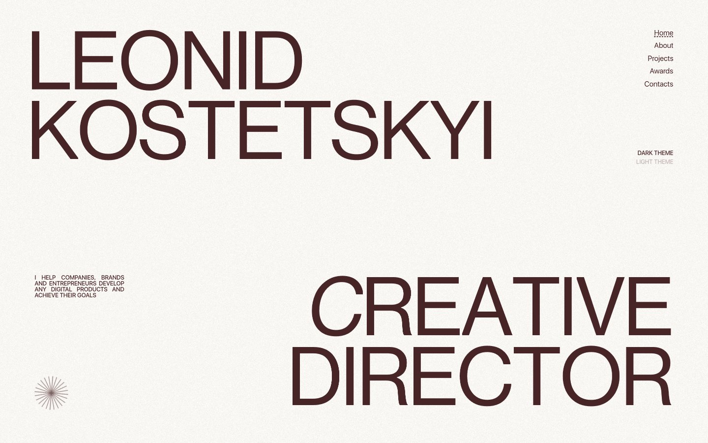
Type-driven architectural minimalism: a stark, high-contrast typographic landscape on a warm, textured canvas.
Colors
#fdfaf3 Page background; a soft, warm off-white providing an antique paper-like feel to the entire experience
#472425 Primary text, headings, outline borders, and a subtle action indicator. Its deep red-brown provides strong contrast without the harshness of true black, defining the brand's sophisticated warmth
#ffffff Background for certain interactive states, subtle borders, and an alternative text color on dark backgrounds
#000000 Background for dark themed sections, and inverse text color. This color is used sparingly to create visual breaks
#121212 Secondary text and outline borders, providing a slightly softer dark tone than Absolute Black
#e73737 Red outline accent for tags, dividers, and focused UI edges. Use as a supporting accent, not as a status color
Do
- Prioritize NeueHaasDisplay for titles and headlines, using large sizes (135px, 188px) with tight letter-spacing (-0.0250em) to create monumental textual elements.
- Maintain a monochromatic base palette using Canvas Parchment (#fdfaf3) for backgrounds and Cocoa Ink (#472425) for primary text and subtle outlined interactions.
- Use no border-radius (0px) for most components, including cards and input fields, to preserve a sharp, architectural aesthetic.
- Indicate interactivity for `Link` and `Button` roles primarily through text color changes or subtle line treatments, avoiding prominent background fills on most buttons.
- Employ generous vertical spacing, specifically a ~200px section gap, to create an airy, uncrowded layout between major content blocks.
- Use Pure White (#ffffff) as the dominant background color for cards and informational blocks within light mode, maintaining visual consistency.
- Apply subtle 1px dashed borders of varying colors (Cocoa Ink, Pure White) to delineate active states or structural elements where a visible separation is needed without heavy lines.
Don't
- Avoid using bright, saturated colors unless specifically for semantic feedback (like Alert Crimson #e73737), as they contradict the brand's muted, high-contrast palette.
- Do not introduce rounded corners (e.g., above 0px radius) for primary UI elements like buttons, cards, or inputs, as this clashes with the sharp, angular design language.
- Refrain from heavy drop shadows or complex elevation schemes; the design is flat and relies on color contrast and minimal borders for visual hierarchy.
- Do not use generic system fonts for display elements; stick to NeueHaasDisplay for impact and SFUIDisplay for readability.
- Avoid dense, information-heavy blocks of text; focus on clear, concise copy supported by ample whitespace and strong typography.
- Do not deviate from the established letter-spacing values for NeueHaasDisplay headlines; the tight tracking is a core part of its visual identity.
- Do not add decorative gradients; the system relies on solid colors and text-based visual interest.