PUBLIC REFERENCE
Stripe Press
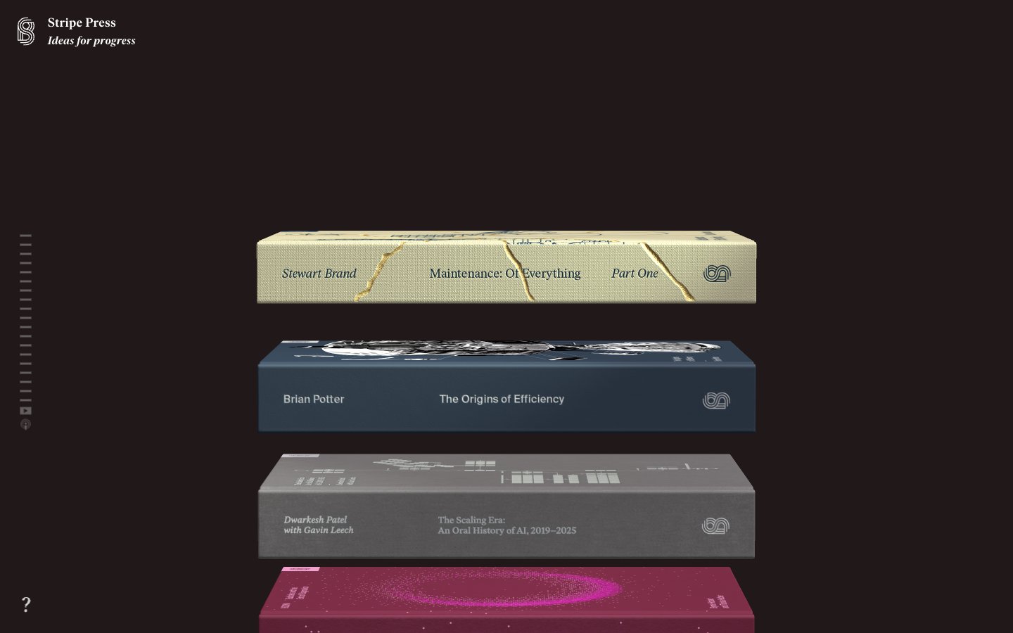
Library of Curated Volumes — each radiating its own quiet brilliance.
Colors
#222222 Primary page background, general surface. The canvas against which all other elements are presented, providing a deep, consistent visual anchor.
#201819 Background for certain interactive elements or sections, offering a slightly warmer, off-black variant for subtle depth contrast.
#000000 Text for light backgrounds (not currently prevalent but present in the data), subtle borders, icons. Used when maximum contrast is needed against lighter neutrals.
#ffffff Primary text color against dark backgrounds, iconography, borders on dark elements. The main bright element that draws attention to content.
#d0d1d4 Subtle text and accents against dark backgrounds, providing slightly lower contrast than Digital White.
#dbdbdb Decorative lines, muted borders, or backgrounds where a very light neutral is needed against a dark surface.
#dfc78 Accent text and borders for specific 'book' modules, evoking aged paper or a golden glow. This color is one of the many distinct identity markers for individual books.
#18185 Accent text and borders for specific 'book' modules, providing a deep, intellectual pop of color. Distinct identity.
#ebadcb Accent text and borders for specific 'book' modules, offering a softer, delicate counterpoint. Distinct identity.
#dee6ff Accent text and borders for specific 'book' modules, a cool, almost metallic bright. Distinct identity.
#e48244 Accent text and borders for specific 'book' modules, a grounded, warm accent. Distinct identity.
#ff4445 Accent text and borders for specific 'book' modules, a bold and energetic marker. Distinct identity.
#0b1743 Accent text and borders for specific 'book' modules, a dark, rich, and mysterious tone. Distinct identity.
Do
- Prioritize `Deep Slate` (#222222) as the default page background for a consistent dark theme.
- Use `Digital White` (#ffffff) for all primary text against dark backgrounds, maintaining high contrast.
- Apply `Ivar Headline` at 15px weight 400 with `letter-spacing: 0.015em` for all navigation and prominent headers.
- Ensure all interactive elements (like book cards) have a distinct accent color for their text and a contrasting background, drawing from the `brand` group.
- Maintain a 0px border radius for most elements and a sharp 2px for subtle interactive components like scroll indicators, preserving the precise, angular aesthetic.
Don't
- Avoid generic button styles with borders or solid background colors, as buttons are primarily represented by the 'book' aesthetic.
- Do not introduce strong drop shadows, as the system relies on distinct background colors for depth and separation.
- Do not deviate from the `Ivar Headline` and `Ivar Text` fonts; custom typography is a core identity element.
- Refrain from using gradients on surfaces or text; this design relies on solid, distinct color blocks.
- Avoid highly rounded corners; the dominant shape is rectangular, with minimal 2px radii for specific components.