PUBLIC REFERENCE
Stripe
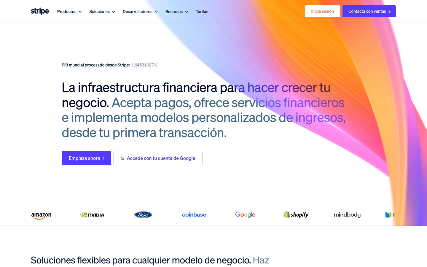
Architectural blueprint on white marble.
Colors
#061b31 Primary text, critical headings, icons, primary button text for ghost buttons
#50617a Secondary text, muted links, subtle borders, descriptive captions
#64748d Tertiary text, placeholder text, inactive states, subtle dividers
#ffffff Page backgrounds, card surfaces, primary button text against dark backgrounds
#f8fafd Secondary card surfaces, subtle background variations
#e5edf5 Background for secondary sections, light card backgrounds
#d8d6df Horizontal rules, subtle borders, graphical elements
#533afd Primary calls to action (buttons, links), active states, significant icons — establishes brand presence and emphasizes interaction
#b9b9f9 Border for ghost buttons, subtle accents
#8087ff Decorative icons, gradient highlights, sub-brand accents
#81b81a Green outline accent for tags, dividers, and focused UI edges
#ff6118 Orange outline accent for tags, dividers, and focused UI edges.
#ffbb00 Decorative gradients in hero sections and product showcases, adding a dynamic, abstract visual element
#7f7dc8 Abstract background graphics, product display panels, adding depth and a tech-centric feel
#ff2ede Decorative illustration elements, feature highlights
Do
- Use Platinum White (#ffffff) as the default page background for most sections.
- Apply Deep Violet (#533afd) specifically for primary interactive elements, ensuring strong visual call to action.
- Employ sohne-var weight 300 for all display and large heading typography to maintain a refined, impactful presence.
- Keep card surfaces subtle, using Powder Blue (#e5edf5) or Porcelain White (#f8fafd) with soft 6px rounded corners.
- Utilize -0.0300em letter-spacing for large text (56px) to maintain a cohesive, modern typographic aesthetic.
- Implement radial and linear gradients for hero banners and product showcases to add dynamic visual interest without overwhelming the UI.
- Maintain a clear elementGap of 8px for logical grouping of related UI elements.
Don't
- Do not use saturated colors for large areas or text unless they are part of a decorative gradient or a specific accent.
- Avoid using hard, sharp shadows; prefer soft, diffused shadows like rgba(0, 0, 0, 0.2) 0px 0px 32px 8px for elevation.
- Do not introduce new font families; sohne-var is the sole typeface for all typographic needs.
- Refrain from using border radii other than 4px and 6px for interactive components and cards, respectively.
- Do not use generic blue for links or buttons; Deep Violet (#533afd) is the designated action color.
- Avoid high-contrast, bold headlines; the system relies on lighter weights (300, 400) even for large text.
- Do not vary line heights significantly from the established typographic scale; ensure dense, compact text blocks for body copy and tighter leads for headlines.