PUBLIC REFERENCE
Claude
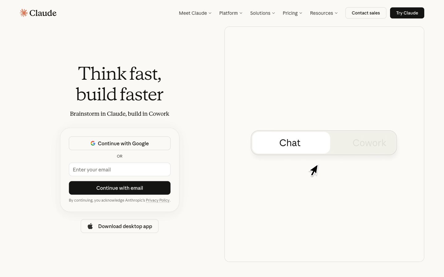
Academic Journal on Vellum — a soft, tactile precision.
Colors
#faf9f5 Page backgrounds, card surfaces, navigation background. Provides a warm, inviting canvas.
#141413 Primary text, main headings, button text on light backgrounds. Creates high contrast and strong legibility.
#1f1e1d Borders, secondary text, darker accents within UI elements. Contributes to definition without harshness.
#3d3d3a Subtle text for secondary information like navigation links and body copy. Softer than Ink Black, but still highly readable.
#73726c Tertiary text, descriptive labels, and subtle UI elements. Less prominent for supporting content.
#9c9a92 Placeholder text, inactive states, faint iconography. Blends into the background more for assistive elements.
#dedcd1 Subtle borders, dividers, subtle background shades. Offers a slight visual separation without drawing attention.
#ffffff Input fields, selected states, and very occasional text on dark backgrounds. A brighter white for interactive elements.
#ccdbe8 Border accents, subtle highlights on interactive elements. A cool, near-gray accent that adds a touch of refinement without being overtly chromatic.
#d97757 Decorative icon accents. Its vividness is contained, making it a controlled burst of warmth.
Do
- Use Vellum White (#faf9f5) as the default background for all page sections and main content cards.
- Apply 9.6px border-radius to all interactive elements, including buttons, input fields, and standard cards, for a consistent soft-edged feel.
- Set primary headings (56px) with Anthropic Serif weight 330 to achieve an articulate, understated voice.
- Ensure all body text uses Anthropic Sans weight 400 to maintain high readability across the interface.
- Utilize Ink Black (#141413) for primary text and CTA button backgrounds to ensure strong contrast against Vellum White backgrounds.
- Maintain a comfortable information density using an elementGap of 8-24px between smaller components, and sectionGap of 32-40px between major sections.
Don't
- Do not use dark, harsh shadows; employ subtle borders like #dedcd1 or rgba(31,30,29,0.15) for depth and separation.
- Avoid overly vibrant or saturated color accents outside of the very specific design system-defined accents like Terra Cotta (#d97757).
- Never use bolding (weights above 500) for headlines; the system relies on lighter weights for stylistic authority.
- Refrain from using sharp, 0px border radii on buttons or cards, except for specific navigation or list item elements that require a more contained appearance.
- Do not introduce new font families; strictly adhere to Anthropic Sans and Anthropic Serif to maintain brand consistency.