PUBLIC REFERENCE
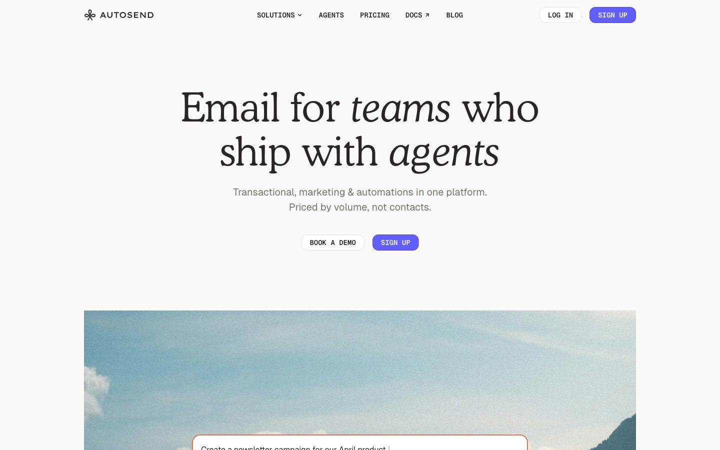
AutoSend
Crisp White Canvas
Colors
#292524 Primary text, strong headings, prominent icons, dark borders
#fafaf9 Page background, button backgrounds
#e7e5e4 Subtle borders, dividers, secondary backgrounds
#ffffff Card backgrounds, elevated surfaces, button text on colored backgrounds
#79716b Secondary text, muted links, subtle icons, placeholder text
#a6a09b Tertiary text, decorative strokes, very light borders
#0c0a09 Deepest text, high-contrast borders
#615fff Primary call-to-action background, active states, key interactive indicators
#4f39f6 Outlined button borders, decorative strokes and accents, links requiring emphasis
#d97757 Decorative card borders, subtle highlights, specific data points
#5ea500 Green outline accent for tags, dividers, and focused UI edges. Use as a supporting accent, not as a status color
#ff0000 Red accent for outlined action borders, linked labels, and lightweight interactive emphasis. Use as a supporting accent, not as a status color
#22b8cd Informational highlights, secondary data points, decorative icons
#007ebb Informational links, decorative borders, specific icon states
#9ae600 Background for subtle highlights, decorative fills for illustrations
Do
- Prioritize Geist for all marketing and UI text, reserving cooperLtBT exclusively for hero headlines and prominent display text.
- Use Paper (#fafaf9) for main page backgrounds and Snow (#ffffff) for card and elevated surfaces to establish surface hierarchy.
- Apply Violet Action (#615fff) strictly to primary call-to-actions, ensuring it consistently signals interactivity and importance.
- Maintain a clear visual rhythm with section gaps of 80px and elemental gaps of 24px.
- Use 8px border-radius for all interactive elements like buttons and input fields, and 16px for larger content cards.
- For subtle depth, apply the card shadow (rgba(0, 0, 0, 0.1) 0px 20px 25px -5px, rgba(0, 0, 0, 0.1) 0px 8px 10px -6px) sparingly, primarily on content cards.
- Utilize Geist Mono for all code snippets, data labels, and elements requiring monospace alignment, applying 0.04em or 0.10em letter-spacing as appropriate for emphasis.
Don't
- Avoid using saturated accent colors other than Violet Action (#615fff) for primary button backgrounds; these are reserved for borders, icons, or specific highlights.
- Do not deviate from the defined border radii; mixing different radius values will disrupt the systematic feel.
- Refrain from introducing new shadow styles; rely solely on the specified card shadow for elevation.
- Do not use generic system fonts for headings or body text, as Geist and cooperLtBT define the brand's typographic identity.
- Avoid excessive use of borders; many components rely on background color differences or subtle shadows for separation.
- Do not use the neutral colors with chromatic names like 'Twilight Indigo' when creating new color tokens; stick to neutral descriptions.
- Do not apply letter-spacing to regular body text set in Geist; it should remain 'normal' for optimal readability.