PUBLIC REFERENCE
xAI
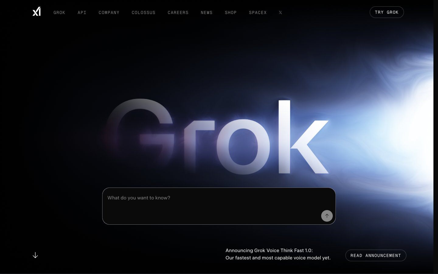
Midnight Command Center: A dark, responsive interface with precise typographic hierarchy and subtle interactive cues.
Colors
#0c0c0b Neutral form states, badge text, and quiet UI feedback where color should stay understated. Do not promote it to the primary CTA color
#1f2228 Secondary background, subtle borders for ghost buttons and card outlines. Its slight tint keeps it from being pure black
#ffffff Primary text, interactive element text, button backgrounds, and subtle highlight shadows. Provides high contrast on dark surfaces
#7d8187 Secondary text for badges, navigation, and body copy. Offers readability without high contrast; Decorative footer background effect, transitioning from dark with subtle color to full black
#474747 Subtle button and navigation borders, creating a very soft outline
#2563eb Violet state accent for badges, validation surfaces, and short status labels. Do not promote it to the primary CTA color
Do
- Retain the dominant dark theme using Deep Midnight (#0c0c0b) as the canvas and Faded Steel (#1f2228) for secondary surfaces.
- Use Frost White (#ffffff) for all primary text, ensuring high contrast on dark backgrounds.
- Apply universalSans with -0.0250em letter spacing for all headlines and body text to maintain the compact, confident typographic style.
- Reserve Electric Blue (#2563eb) exclusively for interactive input focus states and accents, maintaining its visual impact as a sole chromatic element.
- Apply a 9999px border-radius to all interactive buttons for a soft, pill-shaped appearance.
- Set internal padding for feature cards at 16px to create consistent breathing room for content.
- Utilize GeistMono with 0.1000em letter spacing for all badges and auxiliary labels to establish a technical, distinct text style.
Don't
- Avoid introducing additional saturated colors; maintain the restricted palette with Electric Blue as the only vivid accent.
- Do not use heavy box-shadows or significant elevation; prefer subtle borders and slight background shifts for surface differentiation.
- Do not use rectangular, sharp-edged buttons; enforce the 9999px radius for all interactive buttons.
- Avoid large imagery or elaborate illustrations; prioritize clean UI and minimal, abstract graphics.
- Do not use a light theme; the brand identity is firmly established in dark mode.
- Do not vary paragraph line heights or font weights frequently within body text; maintain the universalSans-400, 1.5 lineHeight standard.
- Avoid dense, unbroken blocks of text; break content into manageable sections with clear headings and ample vertical spacing of at least 48px between major sections.