PUBLIC REFERENCE
Raycast
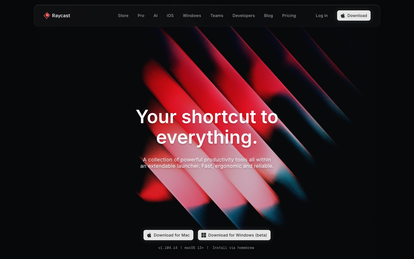
Obsidian command terminal — a near-black void where UI surfaces emerge like backlit glass panels, depth created by shadow layering rather than color contrast.
Colors
#040506 Dominant page canvas and deepest shadow color — the ground state everything floats above
#07080a Primary card and section backgrounds; the first surface level above canvas
#111214 Secondary surface and elevated card backgrounds
#1b1c1e Observed in other boxShadow, link boxShadow, badge backgroundColor. Extracted usage does not support a distinct primary control color.
#363739 Border color for dividers, shadow tones on elevated components
#454647 Subtle borders, muted button borders, body divider lines
#6a6b6c Secondary body text, icon fills, disabled states
#9c9c9d Tertiary text, muted links, placeholder-level labels
#e6e6e6 Primary download/CTA button background — warm near-white on black for maximum contrast without pure white aggression
#ffffff Primary text on dark surfaces, nav links, headline text, icon strokes, border highlights
#ff6363 Observed in body borderColor, other backgroundColor, other fill.
#452324 Observed in other backgroundColor, other borderColor.
#59d499 Observed in other backgroundColor. Semantic/state role was not supported by extracted badge/input evidence.
#56c2ff Observed in other backgroundColor. Semantic/state role was not supported by extracted badge/input evidence.; Hero gradient highlight — linear-gradient(135deg, #56c2ff 0%, #138af2 100%) used for product feature illustration accents
#043f96 Radial section atmosphere gradient — low-opacity blue bloom behind hero and feature sections
#523091 Radial section atmosphere gradient — low-opacity purple bloom for alternate feature sections
Do
- Use #040506 as the page canvas ground — never a warm or cool-tinted near-black, only this near-pure neutral void
- Apply the keyboard key shadow stack (rgba(0,0,0,0.4) outer, rgba(255,255,255,0.2) inset top highlight) on any element meant to feel physically pressable
- Keep headline letter-spacing negative at display sizes: -0.11em at 56px, -0.13em at 64px — critical to the compressed, dense headline feel
- Use radial gradients (blue or violet, max 0.7 opacity core fading to transparent) as per-section atmosphere layers behind content — never flat colored sections
- Badge and chip text: Inter weight 500, positive letter-spacing +0.04em to +0.073em, on #1B1C1 background — the tracking contrast with headlines is part of the two-register system
- For primary CTAs use #E6E6E6 background with #2F3031 text at 8px radius — not white, not a chromatic color
- Use GeistMono weight 300–400 for all code, version strings, and terminal commands at 10–14px with +0.017em to +0.05em tracking
Don't
- Do not use any colored backgrounds for section containers — all surface backgrounds must be from the #040506 → #1B1C1 neutral stack only
- Do not apply border-radius above 20px to cards — the design uses 8px, 11px, 16px, 20px; rounder forms break the precision instrument aesthetic
- Do not use #FF6363 as a button fill or large background — it appears only as a small status dot, icon accent, or single-word label text
- Do not use white (#FFFFFF) as a button background — the primary action uses #E6E6E6 specifically; pure white reads as system/OS chrome at this scale
- Do not use positive letter-spacing on headings above 24px — all display and heading text must track neutral-to-negative
- Do not create dividers between sections using horizontal rules or color changes — section separation happens through 80px vertical gaps and radial gradient shifts only
- Do not use drop-shadows with color tints (blue, red, etc.) — all shadows must be rgba(0,0,0,x) or rgba(255,255,255,x) only, keeping elevation monochromatic