PUBLIC REFERENCE
General Intelligence Company
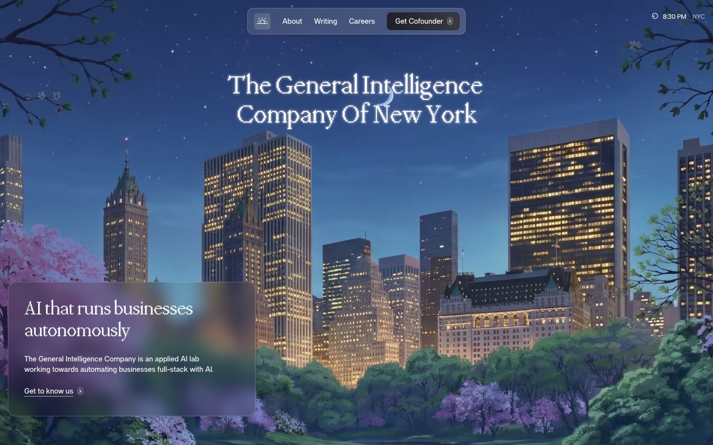
Architectural Night Sky
Colors
#1f1f29 Dark base for hero sections and occasional accent backgrounds; creates a deep, contemplative atmosphere
#0081c0 Highlight elements, card backgrounds for featured content, and active interface states. Its vivid hue draws attention while maintaining a high-tech feel
#41a1cf Border color for ghost buttons and interactive elements, providing a clear but understated active state
#000000 Primary text for headings and bold statements against light backgrounds, emphasizing core information
#ffffff Main page background, component backgrounds, and primary text on dark elements, maintaining brightness and spaciousness
#fefffc Subtle alternative background for secondary sections and cards, creating a slight visual separation from the main canvas
#f9faf7 Background for input fields and navigation elements, providing a soft contrast
#eef1ed Subtle border for UI elements and dividers, offering minimal distinction
#dee2de Hairline borders and soft shadows, contributing to a refined, nearly unnoticeable separation of elements
#171717 Primary body text and deep contrast accents. Used where legibility against light backgrounds is paramount
#2c2c2c Secondary text and less prominent headings, providing contrast below the primary text level
#282834 Darker accent for navigation hover states and subtly outlined actions, providing depth on dark surfaces
#444141 Placeholder text and subtle icon fills, indicating less active states or auxiliary information
#646464 Muted text for helper descriptions and secondary information, reducing visual noise
#b4b8b4 Lightest neutral used for subtle background variations or very soft dividers
Do
- Prioritize PPMondwest for all display and large headings (40px, 48px, 54px) using weight 400 or 500, with letter-spacing -0.0200em for a refined, compact look.
- Use 'Night Sky' (#1f1f29) as a deep, rich background for hero sections or brand-defining modules, contrasting with light body text and elements.
- Layer surfaces with 'Off White' (#fefffc) and 'Canvas White' (#ffffff) to provide subtle depth and structure on light-themed pages, emphasizing 'Canvas White' for main backgrounds and 'Off White' for slightly recessed elements.
- Apply 'Cofounder Blue' (#0081c0) sparingly as a functional accent color for key cards or active states, reserving its prominence for maximum impact.
- Implement soft, layered shadows for card components (e.g., rgba(0, 0, 0, 0.08) 0px 1px 1px 0px, rgba(0, 0, 0, 0.08) 0px 4px 5px 0px) to give elements a subtle lift without feeling heavy.
- Maintain a comfortable density with an element gap of 8px and card padding of 16px, ensuring sufficient breathing room between UI elements.
- Round corners with care: use 4px for small buttons, 8px for main interactive elements, 12px for cards, and 24px for larger, more prominent cards like the 'Hero Overlay Card', with 50.496px for highly rounded nav items.
Don't
- Avoid excessive use of 'Cofounder Blue' (#0081c0) outside of clear accent roles; it should highlight, not dominate, the UI.
- Do not introduce strong, bold colors or gradients other than the defined brand accents; the system relies on a sophisticated achromatic foundation.
- Resist using heavy, opaque backgrounds for layered elements on light pages; instead, favor sublte translucency (rgba(222, 226, 222, 0.16)) for a delicate, modern effect.
- Do not use letter-spacing values tighter than -0.0200em for headings or wider than -0.0100em for body text. Maintain the precise, compact typographic rhythm.
- Refrain from sharp, angular corners for cards and buttons; apply the specified radii (4px, 8px, 12px, 16px, 24px, 50.496px) consistently for a softer, approachable feel.
- Do not deviate from the specified shadow values; the subtle, multi-layered shadows are key to the brand's sophisticated depth without visual clutter.
- Avoid cluttering the layout; aim for comfortable spacing both vertically (32px section gap) and horizontally, letting content breathe rather than stacking elements too closely.