PUBLIC REFERENCE
Gleap
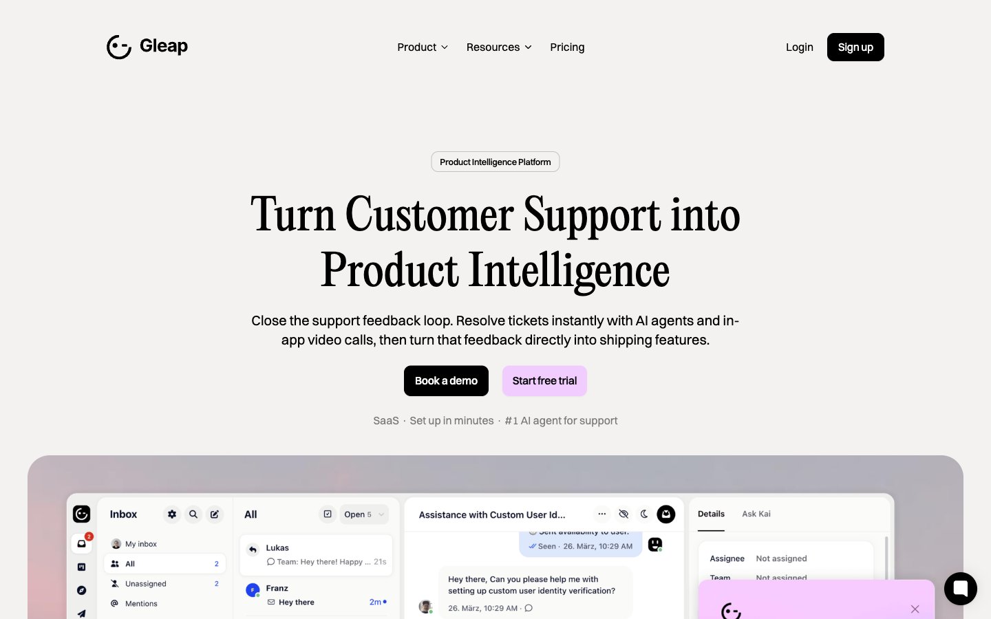
Crisp canvas, magenta highlight
Colors
Cloud Canvas
#f5f2f0 Primary page background, provides a soft, warm base for all content
Porcelain Surface
#ffffff Card backgrounds, elevated content areas, ensuring high contrast with text
Graphite Text
#333333 Primary text color for body copy, links, and detailed information
Ink Text
#000000 Headlines, navigation items, and strong textual elements for maximum emphasis
Platinum Border
#d6d6d6 Subtle borders and dividers for UI separation without harsh lines
Silver Detail
#bcbcbc Muted helper text, secondary borders, and subtle accent lines
Deep Plum
#7b7b7b Tertiary text, less prominent links and meta information
Amethyst Accent
#f1ccff Primary action buttons, prominent links, and accents within cards — it’s the brand’s signature interaction color, signaling interactivity
Sky Blue Highlight
#91e0ff Decorative card backgrounds, highlighted sections or text within content — provides visual interest
Do
- Use PP Editorial New (weight 400) for all display headlines, setting them at 48px or 62px with normal letter spacing for an elevated, editorial feel.
- Apply Switzer (weights 400, 500, 600) for all body text, subheadings, and UI labels, adjusting letter spacing to -0.010em for 16px, -0.020em for 20px, and -0.025em for 32px to maintain visual compactness.
- Elevate primary calls-to-action with Amethyst Accent (#f1ccff) for backgrounds, paired with Ink Text (#000000) for readability.
- Utilize a 10px border-radius for all buttons and badges, reserving 24px for cards and 42px for distinct large elements, to establish a consistent soft-rounded identity.
- Maintain a clear visual hierarchy by using Ink Text (#000000) for critical headlines and bold elements, and Graphite Text (#333333) for standard body copy and descriptions.
- Structure layout using a 1200px max-width container, centered on the Cloud Canvas (#f5f2f0) background, with a consistent 30px vertical gap between major sections.
- Apply subtle elevation to key UI components like Product Feature Cards using rgba(0, 0, 0, 0.04) 0px 8px 16px 0px shadows, while keeping default backgrounds clean and shadow-less.
Don't
- Avoid using multiple chromatic colors for primary actions; Amethyst Accent (#f1ccff) is the singular brand color for interactive elements.
- Do not introduce sharp corners or unrounded containers; enforce the 10px, 24px, or 42px border-radius system meticulously.
- Refrain from using strong, colorful gradients or textures; the system thrives on clean, mostly flat surfaces and subtle, tonal backgrounds.
- Do not deviate from the defined type scale and letter spacing values, particularly for headlines and body text, to preserve the distinct typographic voice.
- Avoid overuse of shadows; reserve the rgba(0, 0, 0, 0.04) 0px 8px 16px 0px shadow for cards and key elevated components only, preventing visual clutter.
- Do not introduce new border colors for UI elements; stick to Platinum Border (#d6d6d6) or Ink Text (#000000) for subtle separation.
- Resist dense layouts; ensure generous use of the 16px elementGap and 40px cardPadding to maintain a comfortable reading experience and visual breathing room.