PUBLIC REFERENCE
Family
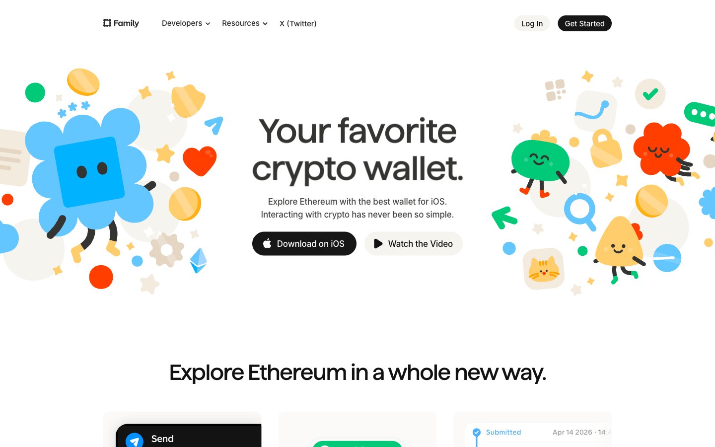
Pixar storyboard on cream paper — playful illustrated characters inhabit a warm off-white world where fintech feels like an adventure game.
Colors
#fbfaf9 Page background, nav background, light button fill
#f2f0ed Card inset border color, secondary button background, subtle dividers
#f8f7f4 Feature card backgrounds (display-p3 0.984 0.980 0.976 approximation)
#474645 Body text, nav links, card body copy — the dominant text color across the entire page
#343433 Nav text, headings at smaller sizes, links — mapped to --color-primary and --color-text
#121212 Primary CTA button background, high-contrast heading text
#000000 Dark card background (phone mockup cards), icon fills
#848281 Muted body text, secondary nav labels
#c6c6c6 Footer text, inactive borders, dividers
#a7a7a7 Disabled states, placeholder text, tertiary labels
#282624 Dark nav overlay text, deep secondary labels
#ff3e00 Primary brand accent — CTA text links, icon highlights, illustration character color — the single most prominent chromatic color site-wide, heat against the cream canvas
#00ca48 Secondary brand accent — success indicators, illustration fills, receive/confirmation states
#0090ff Tertiary brand accent — links in body, illustration fills, Ethereum-related UI elements
#ffbb26 Quaternary brand accent — coin illustrations, star motifs, card highlights
#d48f00 Yellow shadow/stroke in illustrations, icon outlines on yellow elements
#0086fc Link color in body copy, stroke on blue illustration elements
#64c6ff Illustration fill — lighter blue tones on characters and graphics
Do
- Use #fbfaf9 as page background — never pure white (#ffffff) at canvas level; the warm cream cast is the foundation of the tactile feel.
- Apply the inset stone border (box-shadow: color(display-p3 0.949 0.941 0.929) 0px 0px 0px 1px inset) on all white cards instead of a CSS border property — keeps cards off-layout-flow.
- Use border-radius 32px for all pill buttons (both #121212 dark and #f6f4ef light variants) — the pill shape is non-negotiable for interactive elements.
- Apply tight negative letter-spacing to all large text: -2.11px at 68px display, -1.14px at 44px heading-lg, scaling to near-zero at body sizes.
- Restrict the Family custom typeface to display and large section headings only (44px and 68px) — Inter handles all UI text regardless of weight.
- Use Ember Orange (#ff3e00) exclusively for text-link CTAs and illustration accents — never as a button background fill; its power is as an inline pop against cream.
- Space illustration characters asymmetrically around hero text — overlap the headline bounding box with characters to create depth through layering, not z-index stacking.
Don't
- Don't use drop shadows on content cards — the inset warm-stone border is the only surface definition mechanism; shadows appear only on the dark phone mockup and hover-elevated states.
- Don't use pure #ffffff as a page background — it breaks the warm cream identity; #fbfaf9 is the minimum warmth threshold.
- Don't use the illustration characters as pure decoration at small sizes — below 60px they lose their expressive faces and become abstract blobs.
- Don't mix Inter weight 700+ with the Family display typeface — the site uses Inter max weight 600; heavier weights fight the custom font's personality.
- Don't apply Ember Orange (#ff3e00) to more than one UI element per viewport — its rarity is what creates urgency; overuse collapses the hierarchy.
- Don't use border-radius below 10px on cards — the minimum card radius is 10px; anything sharper breaks the soft-edged system.
- Don't use the Violet Pop (#9f4fff), Flamingo (#ff58ae), or Coral Red (#ff2b3a) colors in UI chrome — these are illustration-only accents and have no role in buttons, nav, or body text.