PUBLIC REFERENCE
Superlative
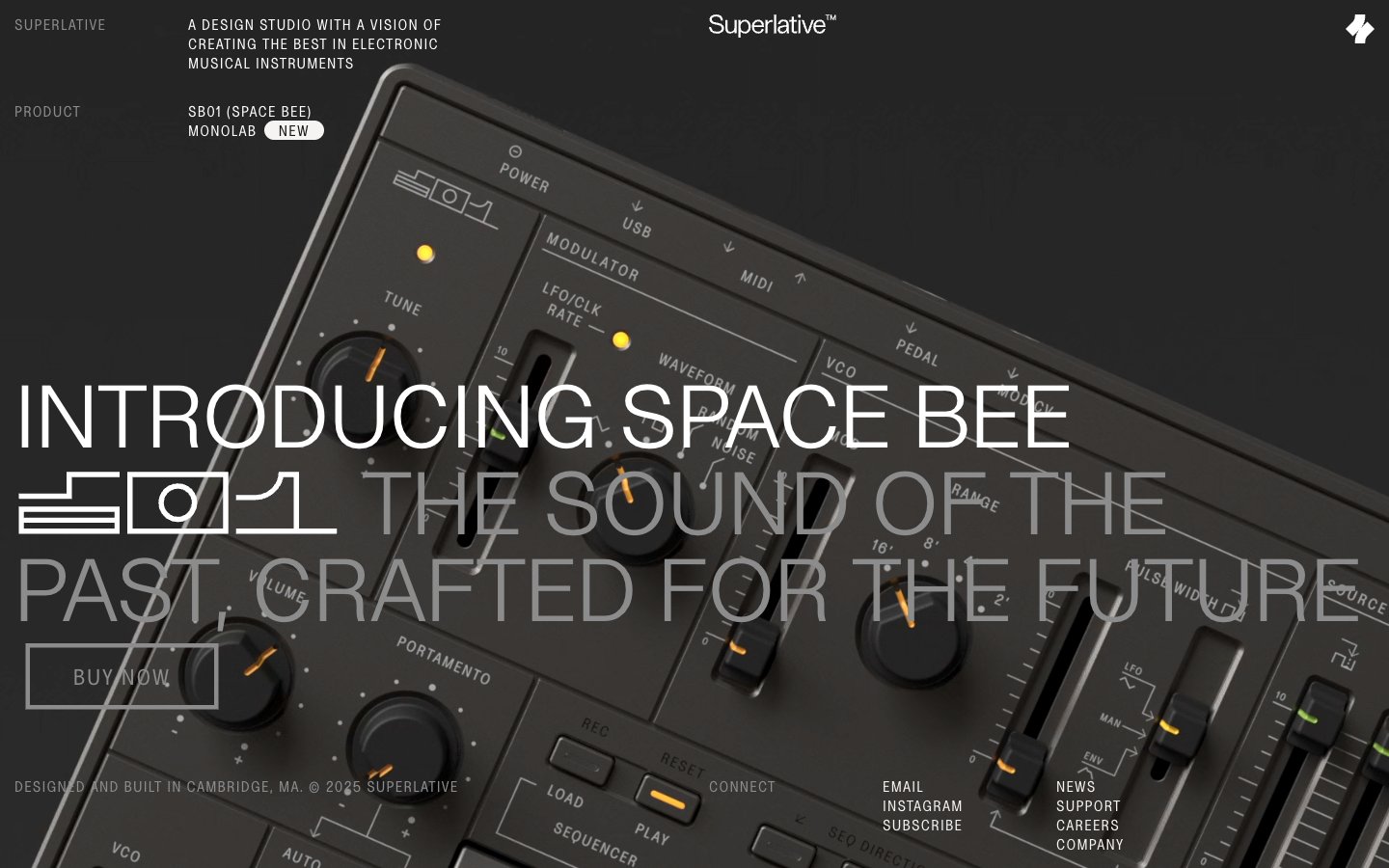
Precision instrument interface—white text glowing on a matte gray panel.
Colors
Superlative Black
#141414 Primary surface background, text color for light surfaces, prominent borders
Instrument Gray
#232323 Secondary surface backgrounds, muted text on very dark surfaces, darker borders
Panel Gray
#8c8c8c Placeholder text, subtle borders, inactive link text, secondary headings
Signal Orange
#e66f27 Orange wash for highlight backgrounds, decorative bands, and soft emphasis behind content. Do not promote it to the primary CTA color
Ghost White
#ffffff Primary text on dark backgrounds, ghost button text, active link text
Surface White
#f6f4f2 Badge backgrounds, specific content sections when a lighter contrast is needed
Divider Gray
#e4e3e2 Subtle borders and dividers on lighter surfaces
Absolute Black
#000000 Outline button borders, selected text on light backgrounds
Do
- Use Superlative Black (#141414) as the default background for most sections.
- Employ Ghost White (#ffffff) text for primary content on dark backgrounds.
- Borders for interactive components should be 1px solid using Superlative Black (#000000) or Panel Gray (#8c8c8c).
- Apply Signal Orange (#e66f27) sparingly, strictly for functional highlights and indicators, not for primary actions.
- Maintain a tight layout with an element gap of 15px for most UI elements.
- Utilize SL-Regular-Condensed with 0.0800em letter-spacing for all headlines and button text.
- Apply a 15px border radius to badges and a 3px radius to outlined buttons, with 0px for Ghost Buttons.
Don't
- Avoid using Signal Orange (#e66f27) for actionable button backgrounds or primary calls to action.
- Do not introduce heavy shadows or excessive elevation; maintain a generally flat and minimalist appearance.
- Refrain from using color gradients, as the system relies on solid colors and strong contrast.
- Never use serif fonts; stick to the sans-serif SL typefaces for a consistent technical aesthetic.
- Do not deviate from the specified tight letter-spacing for condensed fonts or normal spacing for regular fonts.
- Avoid complex or ornamental visual elements; simplicity and utility are paramount.
- Do not use large, soft paddings; maintain compact and disciplined spacing around components.