PUBLIC REFERENCE
Augen Pro
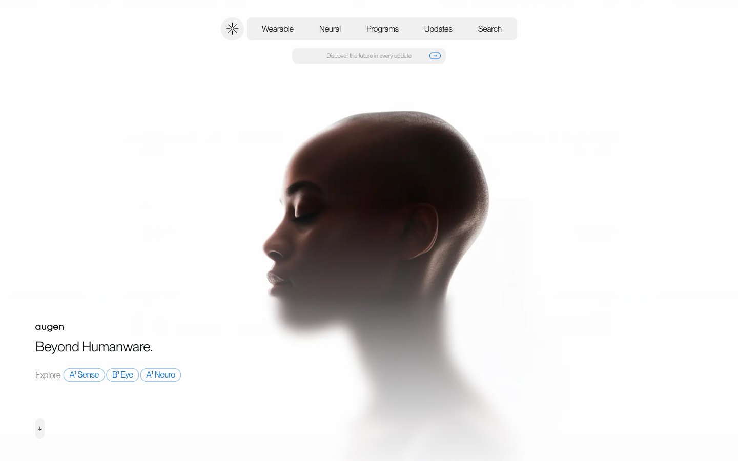
Architectural Blueprint on White Marble. Every element is immaculately placed against a pristine, bright background, creating a sense of technical elegance.
Colors
#0f1012 Primary text, darkest UI elements, default borders. Provides sharp contrast against lighter backgrounds.
#f2f2f4 Dominant page and card backgrounds. Creates a luminous, expansive stage for content.
#fdfdfd Secondary background surfaces, slightly brighter than Ghost White, offering subtle layering.
#868788 Subtle background tones, offering a soft visual break without introducing strong chromaticism.
#8f8f8f Secondary text, button labels, and subtle UI strokes. Provides visual hierarchy without being muted.
#020201 Accented text elements, button states, and fine strokes. Offers the highest contrast.
#0071e3 Interactive elements like links, buttons, and active states. Commands attention as the sole chromatic accent.
Do
- Use Ghost White (#f2f2f4) as the primary background for most sections to maintain a bright, expansive canvas.
- Reserve Future Blue (#0071e3) strictly for interactive states, links, and primary call-to-action elements.
- Apply PP Neue Montreal weight 350 for headlines and larger text where a lighter, more refined feel is desired.
- Implement a default letter-spacing of -0.0200em for all PP Neue Montreal text to ensure a tight, modern aesthetic.
- Utilize 10px border radius for contained interactive elements like navigation tags, providing a soft touch consistent with the Pill Tag Button.
- Employ a base spacing of 6px for element gaps to maintain visual separation without clutter.
- Ensure section padding consistently uses the larger `sectionGap` of 94px to create generous vertical breathing room.
Don't
- Avoid using chromatic colors other than Future Blue (#0071e3) to maintain the minimalist and precise aesthetic.
- Do not introduce strong drop shadows; the design relies on stark contrast and subtle background shifts for hierarchy.
- Do not vary body text weights or families; all continuous text should adhere to PP Neue Montreal weight 400 for consistency.
- Refrain from using excessively large or bold typography; the system prioritizes restraint and clarity over visual shouting.
- Avoid cluttering layouts; adhere to spacious element gaps and section padding to preserve an uncluttered, architectural feel.
- Do not use heavily saturated imagery or illustrations; imagery should align with the sparse, sophisticated visual tone.