PUBLIC REFERENCE
Resend
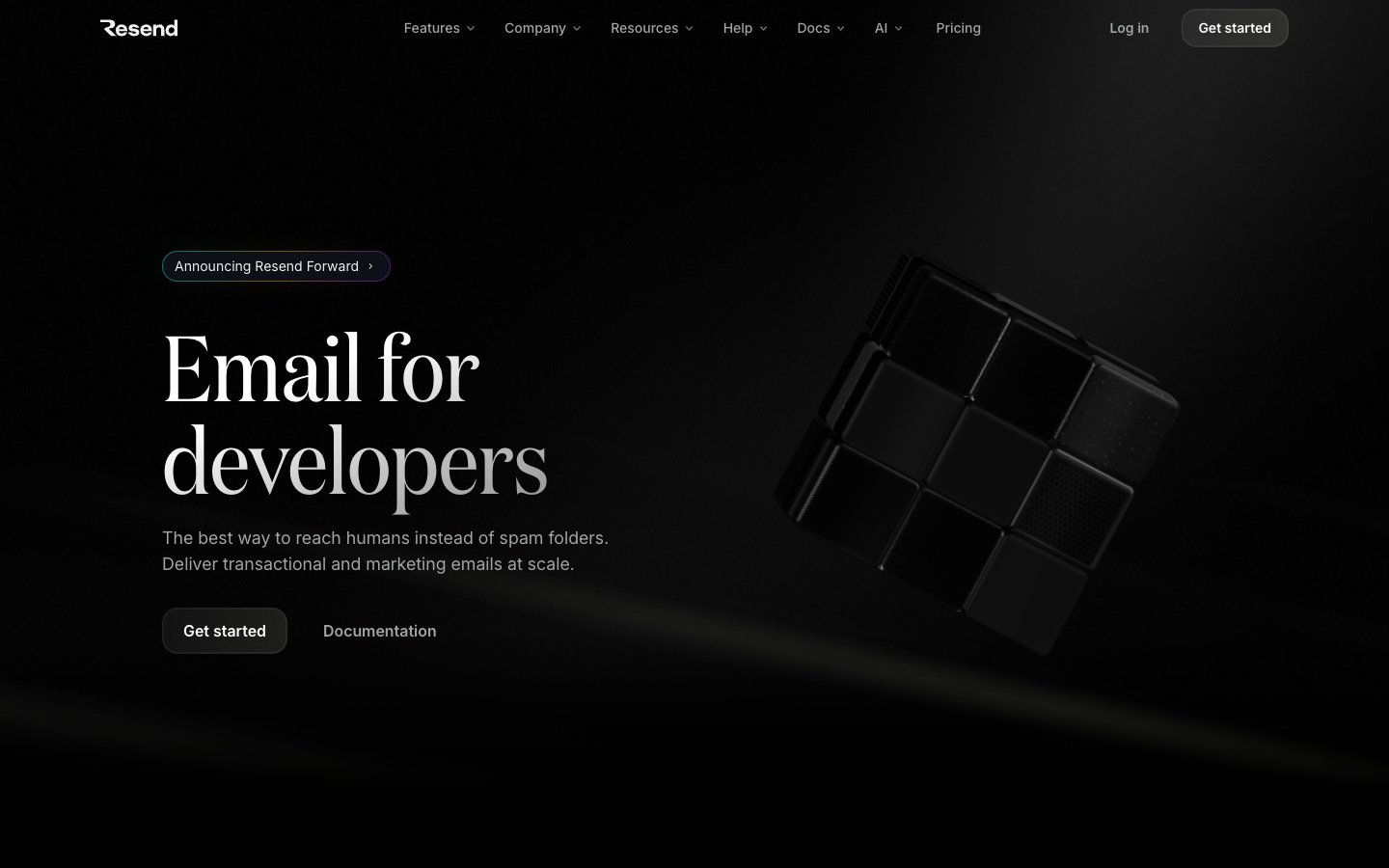
Obsidian developer terminal — every surface reads like polished black glass under a focused beam of white type.
Colors
#000000 Page canvas, card backgrounds — the dominant surface across every section
#292d30 Component borders, dividers, image frames — hairline structural separation on black
#464a4d Subtle secondary borders and muted text-adjacent strokes
#6c6c6c Tertiary text, badge labels, de-emphasized body content
#6e727a Secondary body text, icon strokes at reduced opacity
#a1a4a5 Primary muted body text, icon fills, badge borders
#abafb4 Slightly brighter secondary UI text, active badge outlines
#f0f0f0 Primary content text — headings, body copy, nav labels — the single high-contrast text color on black
#ffffff Maximum-emphasis text, icon fills, active button labels
#3b9eff Blue action color for filled buttons, selected navigation states, and focused conversion moments.
#9281f7 Code syntax highlights, email address text in product UI, decorative icon borders — the brand's signature hue, always used inside product surfaces rather than nav or shell; Email app icon gradient from violet to purple — product identity mark
#1b1b1b Subtle card-to-canvas gradient top — barely perceptible surface elevation on dark UI
#3ad389 Green decorative accent for icons, marks, and small graphic details. Use as a supporting accent, not as a status color
#ff9592 Red decorative accent for icons, marks, and small graphic details. Use as a supporting accent, not as a status color
#ffca16 Yellow decorative accent for icons, marks, and small graphic details. Use as a supporting accent, not as a status color
#70b8ff Blue decorative accent for icons, marks, and small graphic details. Use as a supporting accent, not as a status color
#baa7ff Violet decorative accent for icons, marks, and small graphic details. Use as a supporting accent, not as a status color
Do
- Use #000000 as the default background for every section, card, and container — deviations must be justified by a visible elevation hierarchy via 1px #292d30 border.
- Apply Domaine weight 400 exclusively to hero display text (77-96px) and use ABCFavorit for section headings (56px) — never swap these roles.
- Reserve the six vivid status colors (#3ad389, #ff9592, #ffca16, #70b8ff, #baa7ff, #9281f7) strictly for product-UI data contexts such as email event rows or code syntax — never for decorative section backgrounds or nav elements.
- Use CommitMono for any code, filename, CLI snippet, or developer token — never Inter or ABCFavorit in code contexts.
- Keep button borders at 6px radius for action buttons and pill badges at 16px radius — maintain this distinction to separate call-to-action shape from tagging shape.
- Use #3b9eff only as the outlined border on the primary CTA button — this is the only chromatic color in the nav/shell and must remain singular.
- Set all card padding to 32px and maintain 1px solid #292d30 as the only border treatment — no shadow stacks, no color fills, no gradients on cards.
Don't
- Never use a filled colored background for action buttons — the design uses outlined (#3b9eff border) or ghost (transparent) buttons exclusively. A filled blue or violet button breaks the matte black surface language.
- Never apply Domaine or ABCFavorit to UI chrome such as nav labels, badge text, or button copy — those belong exclusively to Inter.
- Never use more than one vivid status color in a non-product-UI context — the moment a page-level section uses green or yellow as decoration, the email event system loses its meaning.
- Never add drop shadows to cards or sections — elevation is achieved through 1px border contrast on black, not shadow lifting.
- Never use a white or light background for any full-width section — even 'light' content blocks must remain on near-black (#000000 or #0b0e14).
- Never increase letter-spacing on display text — Domaine and ABCFavorit run at negative tracking (-0.01em and -0.05em respectively); positive tracking at display sizes conflicts with the editorial compression of this system.
- Never mix more than two typefaces in a single component — one font for UI copy (Inter) and one for code (CommitMono) is the maximum; headings use ABCFavorit or Domaine depending on size, never both simultaneously.